
 Services
 Solutions
 Main platform
 Technology
 White Label
  Offshore
 Hire developers



You have 5 seconds.
That is how long it takes an Australian shopper to decide whether an online store is trustworthy, before they read a single product description, before they check the price, even before they really look at your logo. In those 5 seconds, their brain does not “read” the website. It scans it, the same way your eyes sweep an unfamiliar room to figure out whether the place is safe.
That is the essence of the “5-second rule”: trust is built through signals, not content. If a store fails to send the right signals in that narrow window, the visitor leaves. Not because they dislike the product, but because of a vague sense that “something is off.”
This is the exact problem facing many DTC brands trying to break into the Australian market. Good product, real traffic, solid ad budget, yet conversion rates stay puzzlingly low. The cause usually has nothing to do with the product or the price. It comes from the store being subconsciously filed under “ghost store,” a category of sites that look real but lack any real foundation of trust.
The fix is not another badge or banner. It is treating trust as a structural layer of the site itself, built with intent, not decorated on afterward.
Why Australians Decide Whether to Trust a Website in Under 5 Seconds
People in Australia usually decide whether to trust a website in under five seconds.
At this stage, they do not read in detail. They quickly scan the page and get a sense of whether it feels trustworthy through the design, the clarity of the brand, and basic signals of safety.
This section explains why that decision happens so fast.
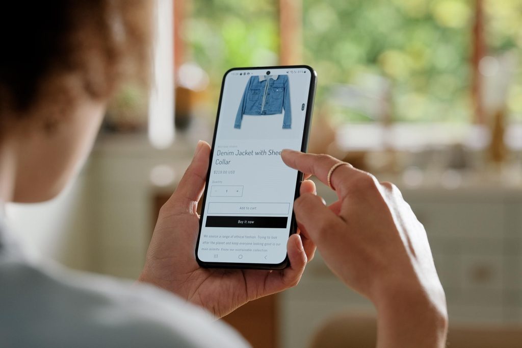
People scan, they don’t read.
Their eyes land on a handful of fixed points (logo, hero image, buy button) rather than reading line by line. The first question in their head is always “is this place safe,” not “is this product good.” For design, this means the most important trust signals, brand name, security cues, return policy, cannot live somewhere that requires scrolling to find. If it isn’t in the first thing they see, it might as well not exist.
They arrive suspicious, not neutral.
Having heard about or personally experienced an online scam, Australian shoppers walk into a new store with their guard already up. That guard doesn’t come down because of a promise (“100% safe!”). It only comes down when there’s evidence that’s hard to fake: a registered business number, a real address, a specific policy. For design, this means don’t try to reassure with words. Prove it with verifiable information.
The .com.au domain is itself a trust signal.
It says, on your behalf, “this business is registered in Australia.” A generic .com isn’t wrong, but it forces the visitor to ask a question the store should have already answered: “is this some unverified cross-border seller?” For design, this means if you can’t change the domain yet, compensate by making everything else explicit, address, phone number, business number, as early on the page as possible.
Most traffic comes from mobile, where there’s no room for extra signals.
A small screen means every trust element is competing for very limited space. For design, this means security badges, return policy, contact number all need to sit within the first screen on mobile, not three scrolls down. Load speed on mobile networks is itself a trust signal, not just a technical detail.
These four realities explain the “why.” But “why” doesn’t turn itself into action. That takes a concrete system.
Read more: Ghost Stores in Australia: How Real Online Stores Can Prove They’re Trustworthy from the First Visit
The 5-Second Trust Framework for Ecommerce Websites
Trust in ecommerce isn’t a random feeling. It’s the cumulative result of five groups of signals, appearing almost simultaneously in front of the user. Any store that wants to be trusted instantly needs all five.
1. Identity
Before trusting a store, people need to know who’s actually selling to them. A store that hides its identity (no clear company name, no legal information, no brand story) will always read as high risk, no matter how good the design looks. In Australia, this usually shows up as a clearly displayed ABN (Australian Business Number) in the footer or on an “About Us” page. An ABN isn’t just a legal requirement, it’s a strong psychological signal: it says “this business is registered, traceable, and accountable.” Beyond the ABN, a full company name, founding year, and a short brand origin story all reinforce this layer.
2. Legitimacy
Does this store actually exist in the real world, or only online? The .com.au domain is the single most important answer to that question, cheap to get and disproportionately effective at building trust with Australian shoppers. Beyond that, signs of physical presence, an office or warehouse address, a phone number with an Australian area code, specific business hours, all help a store escape the feeling of “existing only on the internet.” A store that offers nothing but a contact form, with no other verifiable information, will always be met with suspicion.
3. Risk Reduction
“If I buy this and I’m not happy, what do I lose?” That’s the biggest question in a buyer’s mind, and the store needs to answer it before they even ask. A clear return policy, written in plain language rather than dense legal text, matters most. Transparent shipping information, expected delivery time, cost, carrier, needs to sit near the point of decision, not buried on a separate policy page. Payment security icons (SSL, trusted gateways like PayPal, Afterpay, Stripe) act as the final safety check right before someone enters their card details.
4. Social Proof
People trust other people far more than they trust brand messaging. Third-party reviews (Google, Trustpilot) carry more weight than reviews collected on the store’s own site, because they’re harder to fake and independently verified. User-generated content, real photos of customers using the product, unboxing videos, embedded social posts, feels far more authentic than studio product shots. The volume of reviews matters almost as much as the score: 4 stars with 500 reviews is usually more convincing than 5 stars with 3.
5. UX Clarity
None of the signals above matter if the site itself is unpleasant to use. Load speed comes first, a site that takes more than 3 seconds to load triggers suspicion automatically, regardless of how good the content is. A clean, uncluttered layout helps people know where they are in the buying process. High-quality product photos, multiple angles, complete sizing and spec information, all reduce the feeling of “buying something I can’t actually see.”
These five groups don’t work in isolation, they reinforce each other. A store with a clear ABN but slow load times still loses trust points. A fast, beautiful store with no reviews still makes people hesitate. Trust is the sum of the whole experience, not a simple checklist of individual parts.
What Users Actually Look At in the First 5 Seconds
The five groups above describe what needs to exist. But where do they actually show up in real behavior?
The hero section, the first point of contact
The moment the homepage finishes loading, a user’s eyes land on the hero section in under a second. This is where they form their first impression of how professional the brand is: image quality, message clarity, whether everything feels coherent. A hero section with blurry visuals, hard-to-read text, or a vague message (“Discover our new collection!”) that doesn’t say what’s actually being sold will disorient a visitor from the very first second.
The habit of scrolling straight to the footer.
Many users, especially cautious ones, scroll directly to the footer before deciding whether to stay, a behavior that gets little attention but matters a great deal. They’re looking for contact information, return policy, payment icons, sometimes a company address. An empty footer, or one with nothing but a couple of social links, is one of the clearest “ghost store” signals there is.
Trust cues at checkout
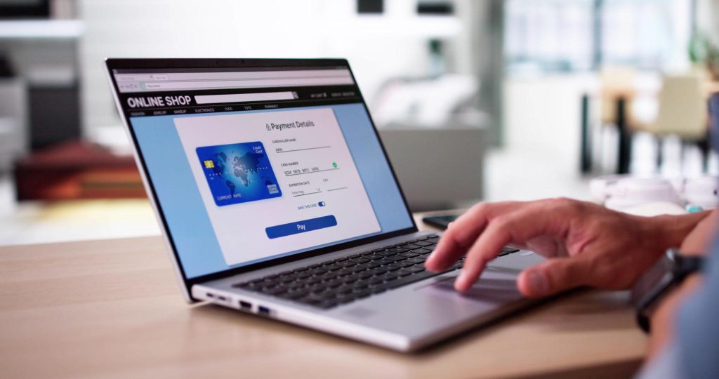
This is the highest-risk step in the entire journey, the moment someone is about to enter their payment details. A security lock icon, familiar payment gateway logos, and a clear order summary with no surprise fees are what determine whether they abandon the cart in the final seconds or complete the purchase.
The silent question: “Is this a real store?”
Underneath all three touchpoints above sits a question users keep asking themselves without quite realizing it: does everything here feel coherent and intentional, or does it feel like mismatched pieces bolted together in a hurry? Consistency in brand color, tone of voice, image quality, and response speed all add up to a single feeling: someone real is actually behind this website, and they care about my experience.
Trust Checklist for High-Converting Ecommerce Websites
The five theoretical groups above translate into a checklist, organized around five practical areas.
Group 1: Legal transparency
- ABN clearly displayed in the footer and on the About Us page
- Full company name, matching official business registration
- Terms of Service and Privacy Policy written for the Australian market specifically, not copied from a US or UK template
- Information on compliance with Australian Consumer Law, particularly around warranty and refund rights
Group 2: Contact structure
- Phone number with an Australian area code (not just email or a chatbot)
- A real address (office or warehouse), even for stores without a physical retail presence
- Specific customer support hours in Australian time
- An easy-to-find Contact Us page, not buried deep in the menu
Group 3: Policies aligned with Australian law
- Return policy with a clear timeframe (e.g. 30 days), conditions, and who covers return shipping
- Shipping policy with estimated delivery times by state, distinguishing metro from regional areas
- GST clearly reflected in displayed pricing
Group 4: Visual proof
- High-quality product photos from multiple angles, including real lifestyle shots
- Demo or unboxing video where possible
- Payment security icons visible at checkout, not just on the homepage
- Consistent visual style across the entire site, no mixing of photo styles
Group 5: Review ecosystem
- Reviews integrated from a third-party platform (Google, Trustpilot, or a reputable Shopify review app)
- Review count displayed alongside the average score
- Customers encouraged to submit real photos and videos
- Public responses to negative reviews (this actually builds trust, since it shows a real person is behind the brand)
Auditing your current store against each group, rather than trying to fix everything at once in a vague way, is the fastest way to see what’s missing.
Mistakes That Make an Ecommerce Store Look Like a Ghost Store
Building it right is one thing. But a few common mistakes still get otherwise good stores labeled “untrustworthy” in a visitor’s subconscious.
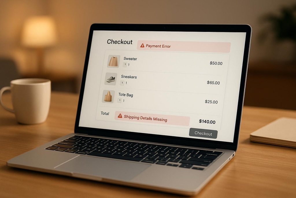
Fake scarcity
Countdown timers reading “Only 2 hours left for this discount!” that reset on every page reload, or notices claiming “15 people are viewing this product” with no basis in reality. This used to be a common tactic, but modern consumers, and Australian shoppers in particular, who tend to be fairly skeptical of marketing tricks, have learned to spot it. Once caught, fake urgency doesn’t just stop working, it destroys the trust built everywhere else on the site.
Using an unedited template
Using a popular Shopify theme isn’t the problem. The problem is when a store makes no effort to add its own identity, ending up looking identical to hundreds of other stores people have already seen, and possibly already had a bad experience with. That anonymous sameness accidentally puts people on guard instead of making them feel comfortable.
Missing identity signals
This is the most serious and most common mistake: no ABN, no address, no phone number, just a contact form and a generic info@ email address. For a cautious shopper, this reads almost as an immediate red flag.
Inconsistent branding
One version of the logo, a different color scheme in Facebook ads, a tone of voice on product pages that doesn’t match the About Us page. That inconsistency, even when minor, creates a patched-together feeling that makes people question how seriously the brand takes itself.
Real Example: Strong vs Weak Ecommerce Store Design
Put two types of stores side by side and the framework above becomes obvious immediately. Think of this as a 5-second teardown.
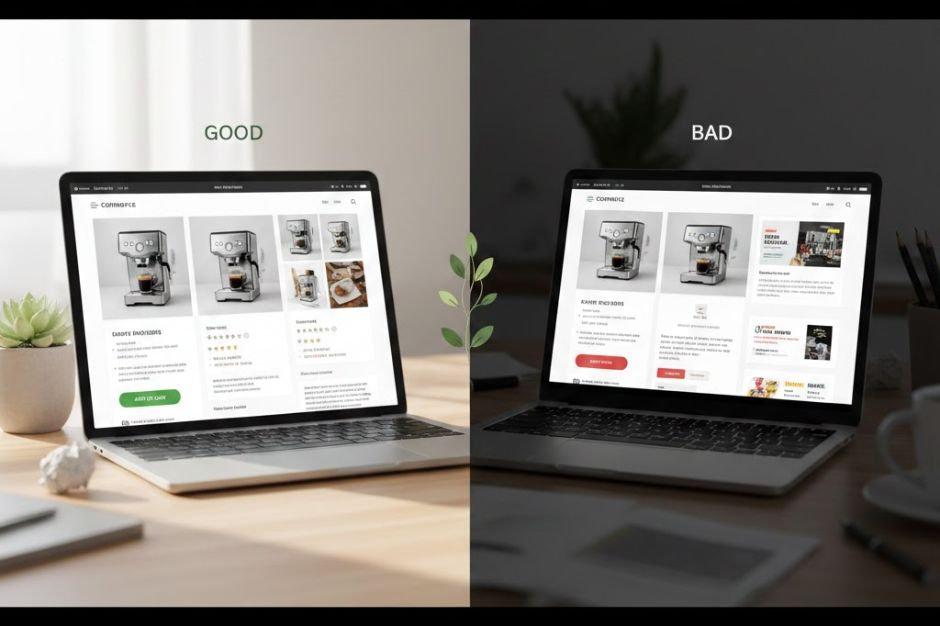
Weak store (a typical “ghost store”):
The homepage opens with a big discount banner but no clear indication of what’s actually being sold. Scroll down and product photos are low resolution, inconsistent in lighting and style. The footer has three lines: an Instagram link, a copyright line, and nothing else. No ABN, no address, no clear return policy. At checkout, no security icon appears anywhere, and the total changes suddenly when shipping is added at the last step. The whole experience, without any single glaring technical bug, still leaves the impression that “someone put this together in a hurry.”
Strong store (a typical trustworthy site):
The homepage opens with a clear hero section, a specific product, a short positioning statement, load time under 2 seconds. Scroll down and product photos are stylistically consistent, mixing lifestyle shots with close-up detail. The footer shows everything: ABN, a head office address in a specific Australian city, phone number, clear policy links. Right under the “Add to Cart” button sits a short line about expected delivery time and a 30-day return policy. At checkout, familiar payment icons (Afterpay, PayPal, Visa/Mastercard) are clearly visible, and the total, including shipping, is shown transparently from the start.
The difference between these two stores has nothing to do with design budget or product quality. It comes down to one having a deliberately built trust structure, and the other not having one at all.
Conclusion
Trust in ecommerce is not something you get by chance, and it’s not something you can fix at the end with a few trust badges or design tweaks. It is built into the foundation of the store itself. A real trust system is made up of clear identity, verifiable business details, transparent risk information, real social proof, and a consistent, easy-to-understand user experience.
When you look at it this way, the question changes. It is no longer “how can I make this store look better,” but “which part of trust is missing here.” This is how professional ecommerce teams think about building and improving online stores. At ONEXT DIGITAL, for example, the focus is not on surface-level design changes, but on building trust as a system from the ground up, so that within the first five seconds, Australian shoppers already feel confident they are in the right place.
FAQs
Why do Australians decide whether to trust a website so quickly?
Because online shoppers rely on visual and structural signals, not detailed reading. Within seconds, they scan for cues like design quality, brand clarity, and trust signals to judge if a store feels safe.
What makes an ecommerce website look trustworthy in the first 5 seconds?
Clear branding, a strong hero section, visible contact details, secure payment indicators, and consistent design all help users immediately feel the store is legitimate.
What is a “ghost store” in ecommerce?
A ghost store is an online shop that looks real but lacks credibility signals such as business identity, reviews, or clear policies. Users often leave quickly when they sense something feels incomplete or inconsistent.
Do trust badges alone increase conversions?
No. Trust badges help, but they are not enough on their own. Trust is built through a combination of identity, transparency, social proof, and overall user experience not decorative elements.
Where should trust signals be placed on an ecommerce website?
They should appear above the fold on the homepage, in the footer, and at checkout. Users should not need to search for essential information like return policies, contact details, or payment security.
What is the fastest way to improve trust on an ecommerce store?
Start with clarity: show who you are, make policies easy to find, improve homepage structure, and ensure consistent branding. These changes have a stronger impact than adding more visual elements.