Squarespace is a website building platform known for its ease of use and versatility. It lets you create stunning websites for almost anything you can imagine.
From launching a blog to showcasing your creative portfolio, selling products online, or promoting your wedding photography services, Squarespace has the tools you need to get started. The best part? You don’t have to be a coding whiz or design guru! Squarespace’s user-friendly templates and intuitive interface make building a professional website a breeze.
Get ready to be amazed! We’ve curated a collection of exceptional Squarespace websites from diverse fields to spark your creativity and show you just what’s achievable. But before we jump in, let’s address a few key points…
Why Choose Squarespace?
Squarespace has become a go-to platform for many creators and entrepreneurs (especially those new to website building). It boasts millions of websites across various industries, showcasing its versatility.
This popularity translates into a wealth of benefits for you. Choosing Squarespace empowers you to create and manage your website with ease, ultimately propelling your business forward.
Top Reasons Squarespace Stands Out
1. Easy to Use:
Squarespace is designed with beginners in mind. No prior coding knowledge is required, so anyone can create a professional-looking website. It’s as straightforward as building with building blocks!
2. Stunning Templates:
Squarespace boasts a vast library of beautiful and responsive templates. These pre-designed layouts are a fantastic starting point, but you can also customize them to perfectly match your brand identity.
3. Mobile-Friendly by Default:
Gone are the days of worrying about mobile responsiveness. Every Squarespace template is automatically optimized for all screen sizes, ensuring your website looks incredible on desktops, tablets, and phones.
4. All-in-One Convenience:
With Squarespace, you only need one platform to manage everything. Hosting, domain registration, SSL certificates, email marketing – they’ve got you covered. It simplifies website management and saves you time.
5. SEO Friendly:
Getting found online is crucial. Squarespace provides built-in SEO tools to help you optimize your website content for search engines, potentially leading to more organic traffic and visitors.
6. Effortless Ecommerce:
Thinking about selling online? Squarespace has all the features you need, from setting up a beautiful online store to accepting payments and managing your inventory. It makes starting an online business a breeze.
7. 24/7 Support:
Squarespace offers exceptional customer support, available around the clock. Whether you have a quick question or need more in-depth assistance, their friendly and professional team is always there to help.
8. Seamless Integrations:
Squarespace seamlessly integrates with various third-party services. You can easily connect your website with social media platforms, email marketing tools, appointment scheduling apps, online courses, and more, extending its functionality.
Free Trial to Explore: Not sure if Squarespace is right for you? No problem! Take advantage of their generous 14-day free trial. Experiment with different designs, explore the features, and see for yourself how easy it is to create a stunning website. Two weeks is plenty of time to make an informed decision.
Squarespace Website Examples That Shine (2024)
Here are a few more inspiring Squarespace websites to spark your creativity:
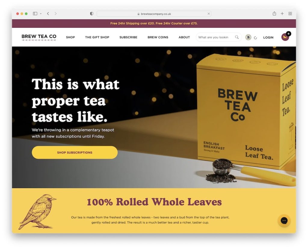
1. Brew Tea Co
The Baker’s Table is a Squarespace website that uses its features to create a delightful online bakery experience. A welcoming pop-up greets visitors with a discount on their first order, while a top bar notification uses sliding text animation to highlight special promotions. The hero section showcases their most tempting treats with a full-width slider that captures attention and features clear CTAs (calls to action) to “Shop Now” or “Learn More.”
Another user-friendly element is the mega menu, which effectively organizes the various product categories and pages, making navigation a breeze.
What we love most:
- Warm and inviting design that reflects the bakery’s brand personality.
- Engaging hero slider showcasing products and encouraging action.
- Well-organized mega menu for easy navigation through all offerings.
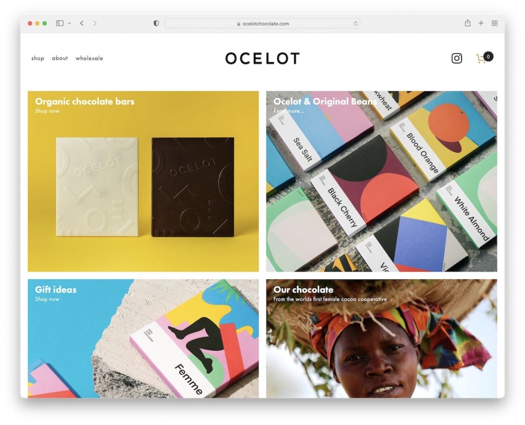
2. Ocelot Chocolate
Ocelot Chocolate is a delightful Squarespace website that showcases handcrafted chocolates with a focus on minimalist design. The first thing that grabs your attention is the captivating hero section featuring a parallax effect, bringing their delectable treats to life with subtle movement.
Unlike cluttered websites, Ocelot Chocolate keeps the header unobtrusive. It remains transparent as you browse, ensuring a distraction-free experience. However, it cleverly reappears when you scroll back up for easy navigation.
What we love most:
- A captivating hero section with a parallax effect that draws visitors in and showcases their chocolates in a dynamic way.
- A transparent header that minimizes distractions while browsing but reappears for easy navigation.
- A conveniently placed shopping cart icon within the header for effortless online shopping.
- Large image sections with clear descriptions that make their chocolates truly irresistible.
- An engaging Instagram feed that connects with customers and builds brand loyalty.
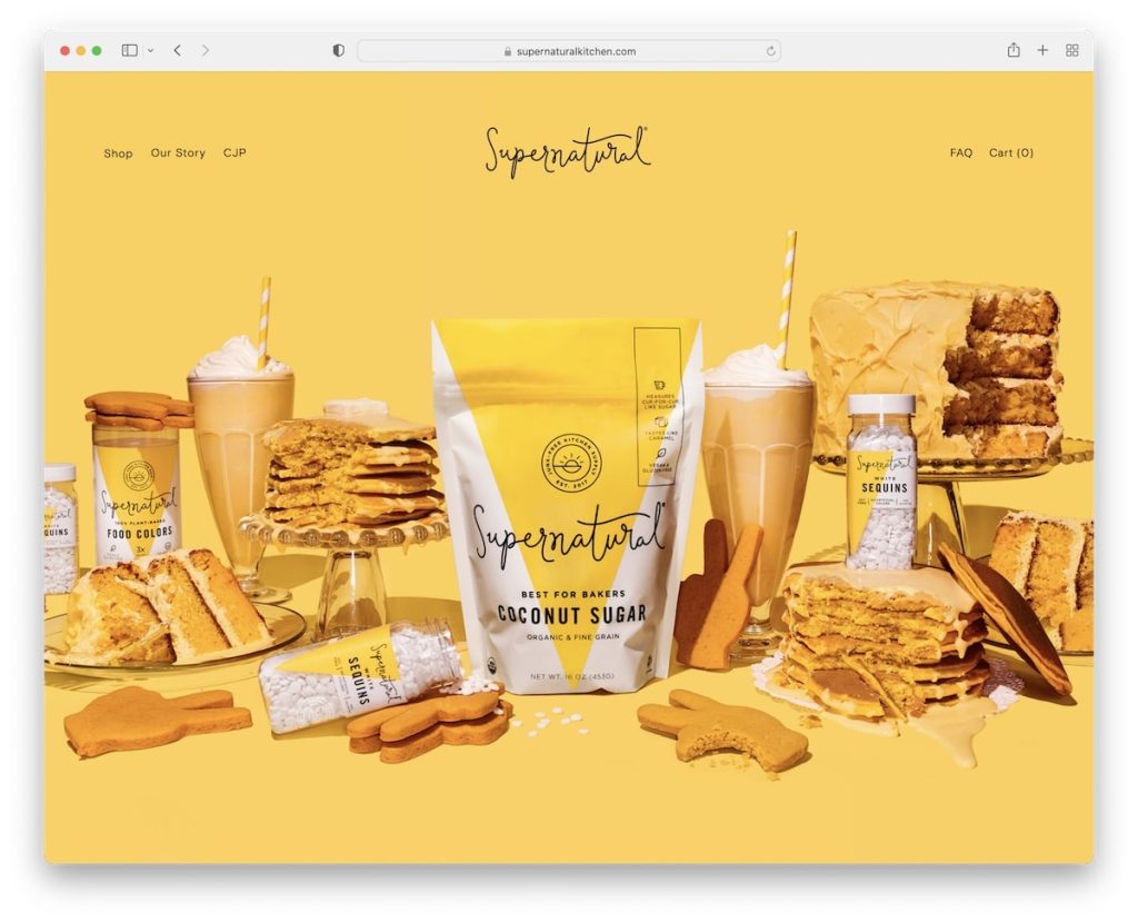
3. Supernatural
Supernatural utilizes a Squarespace website to showcase their passion for coffee with a clean and practical approach. The website opens with a powerful hero image featuring a steaming cup of coffee, perhaps with coffee beans cascading around it, thanks to a subtle parallax effect. The transparent header complements the clean design, ensuring a clutter-free browsing experience.
What we love most:
- A captivating hero image with a parallax effect that sets the tone for a rich and satisfying coffee experience.
- A transparent header that maintains a clean and distraction-free browsing experience.
- Ample white space throughout the website, allowing product information and brewing guides to be easily digestible.
- Large, full-width sections featuring enticing photos of their coffee beans and brewing equipment.
- A curated Instagram grid that showcases customer experiences and fosters a sense of community.
4. Jones Bar-B-Q
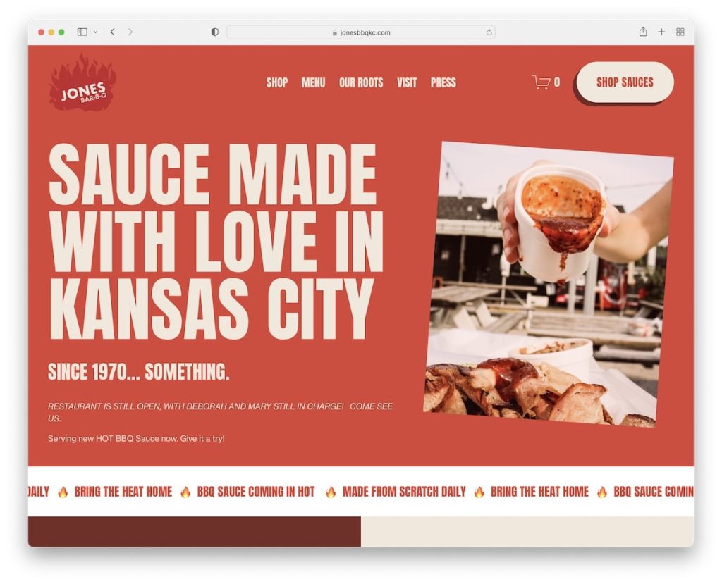
Jones Bar-B-Q utilizes a Squarespace website to capture the bold and mouthwatering essence of their barbecue. It all starts with an impressive hero section featuring large, mouthwatering text alongside a captivating image, followed by a dynamic sliding text animation that keeps visitors engaged. The CTA button in the header leads you directly to the online shop, while a dedicated “featured in” section prominently displays logos and accolades, building instant credibility. Jones Bar-B-Q understands the user experience, their header cleverly disappears when scrolling down and reappears when scrolling up, keeping distractions at a minimum.
What we love most:
- Large and bold typography in the hero section that grabs attention and makes you crave their BBQ.
- A disappearing and reappearing header depending on the scrolling movement, minimizing distractions.
- A dynamic sliding text animation in the hero section for an added layer of engagement.
- A prominent “featured in” section that showcases their credibility and awards.
5. Minna
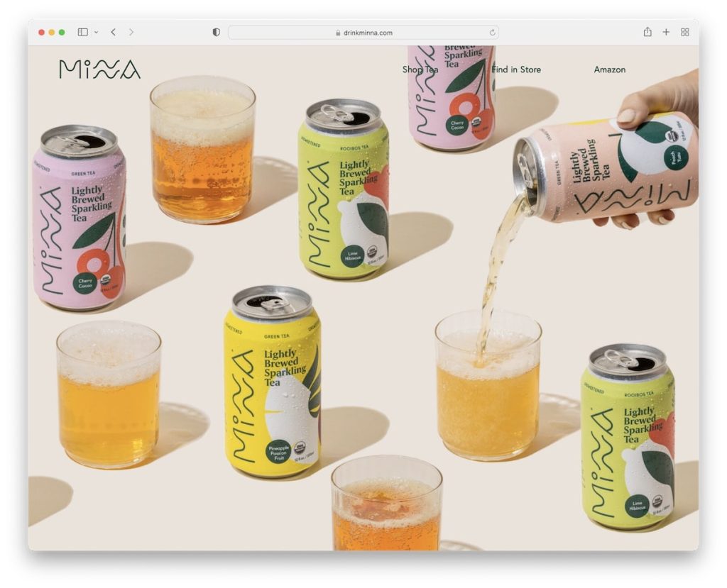
One of the most striking features of Minna’s Squarespace website is the full-screen image background above the fold. This captivating image, likely showcasing a vibrant blend of fresh fruits, sets the tone for a refreshing and healthy experience. While there’s no text or CTA button in this section, the parallax effect adds a touch of interactivity.
What we love most:
- A distraction-free above-the-fold section with a
- full-screen image background featuring a vibrant blend of fresh fruits and a subtle parallax effect, instantly transporting visitors to a world of refreshing flavors.
- Large product presentation sections with clear descriptions and shop buttons, allowing for effortless exploration and purchasing of their healthy juice creations.
- A captivating Instagram feed that showcases customer creations using Minna’s products, fostering a sense of community and inspiring recipe ideas.
- A minimalist footer providing a clean finish with essential navigation links and a newsletter signup form, keeping visitors connected and informed about new offerings.
6. Peter McKinnon
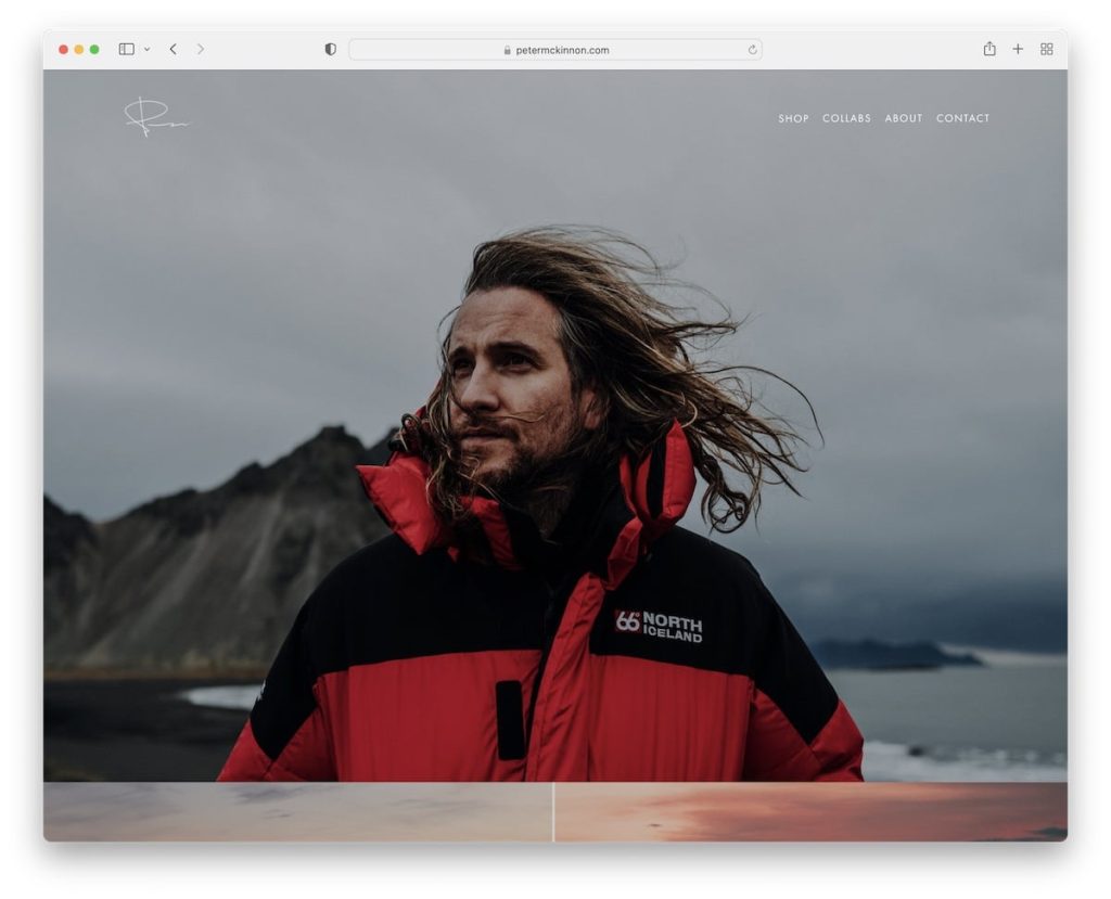
Peter McKinnon’s Squarespace website is a visual feast for any photography enthusiast. The homepage explodes with stunning imagery, enhanced by a parallax effect that creates a truly immersive experience.
A sleek, transparent header with a dropdown menu sits unobtrusively at the top, while the footer offers a prominent platform for social media links and a newsletter signup form. But the real highlight lies in Peter’s seamless integration of an eCommerce section. Here, visitors can explore and purchase prints, presets, photography gear, and more – a testament to the versatility of Squarespace.
What we love:
- Massive and captivating image and video sections that fill the screen.
- A fully functional online shop – perfect for selling anything, not just photography products.
- A website that prioritizes clean design, placing the content front and center.
7. Olga Miljko
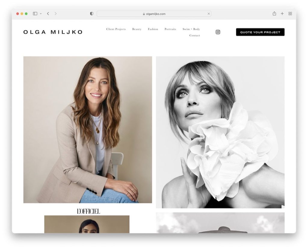
Olga Miljko’s Squarespace website wastes no time showcasing her talent. A long, two-column grid on the homepage immediately grabs your attention and throws you right into the heart of her portfolio.
To ensure a smooth browsing experience, the website employs a clever header that disappears as you scroll down and reappears when you need to navigate back to the top. Additionally, Olga maintains a clean and unified aesthetic by using a consistent white background across all sections – header, footer, and everything in between.
What we love:
- A captivating portfolio grid that takes center stage on the homepage.
- A convenient disappearing/reappearing header that eliminates the need for endless scrolling.
- A light and clean design that lets Olga’s work shine through.
8. Shanley Cox
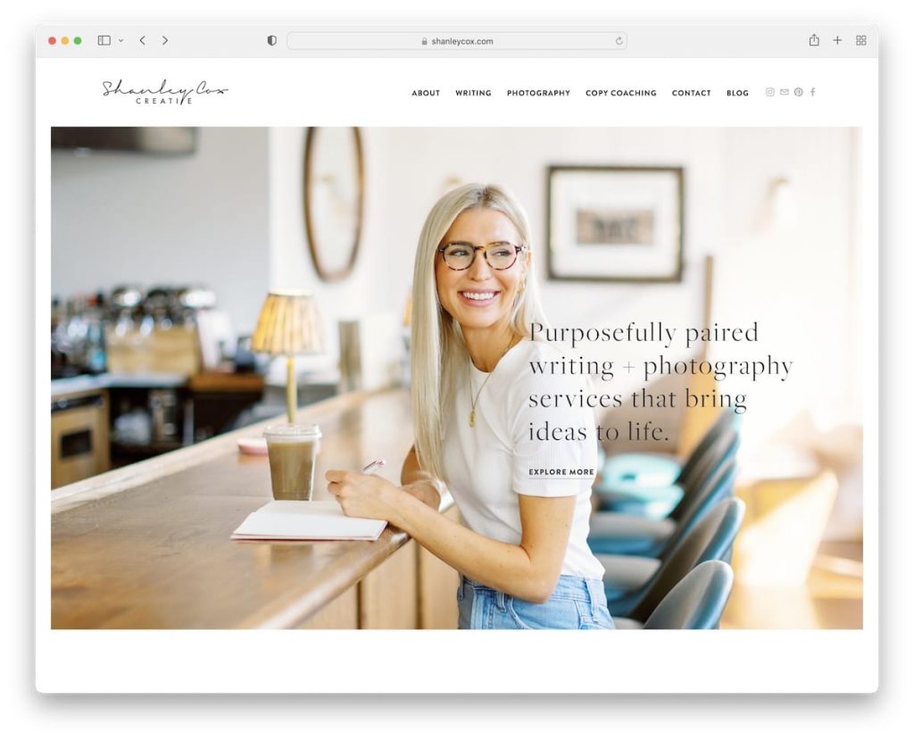
A warm and welcoming feeling greets you as you land on Shanley Cox’s Squarespace website. A prominent image instantly sets a personal tone, allowing you to connect with Shanley right away.
The homepage skillfully balances a wealth of information with a clean design. Strategically placed white space ensures a smooth user experience. Testimonials, a contact form, and an integrated Instagram feed all come together to create a valuable resource for potential clients. While the overall feel suggests a one-page website, Shanley cleverly expands her online presence with additional informative pages and sections.
What we love:
- A personalized touch that fosters a sense of familiarity with Shanley.
- A conveniently placed contact form on the homepage for easy inquiries.
- A testimonials slider that builds trust and showcases the value Shanley offers.
9. Scott Snyder
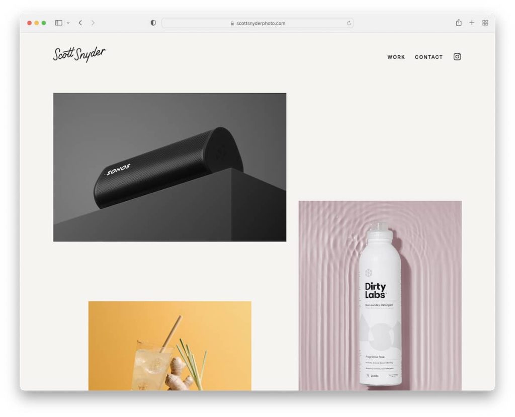
Scott Snyder’s Squarespace website is a prime example of a photographer’s portfolio done exceptionally well. The home page stuns visitors with a unique grid layout showcasing his work. This captivating grid seamlessly blends static and animated photographs, highlighting Scott’s creative vision in a dynamic way. Each image thumbnail is clickable, allowing for a smooth transition to dedicated project pages with detailed information.
The website’s navigation bar remains transparent, ensuring a clutter-free browsing experience. It cleverly reappears upon scrolling up for easy access to different sections. Furthermore, to establish his credibility, Scott incorporates a dedicated section proudly displaying the logos of well-respected brands he’s collaborated with.
What we love most:
- A captivating home page grid showcasing Scott’s photography with a mix of static and animated elements.
- Clickable thumbnails on the grid, allowing for effortless exploration of individual projects.
- Inclusion of client logos to build trust and establish Scott’s reputation as a skilled photographer.
10. Alex Tran
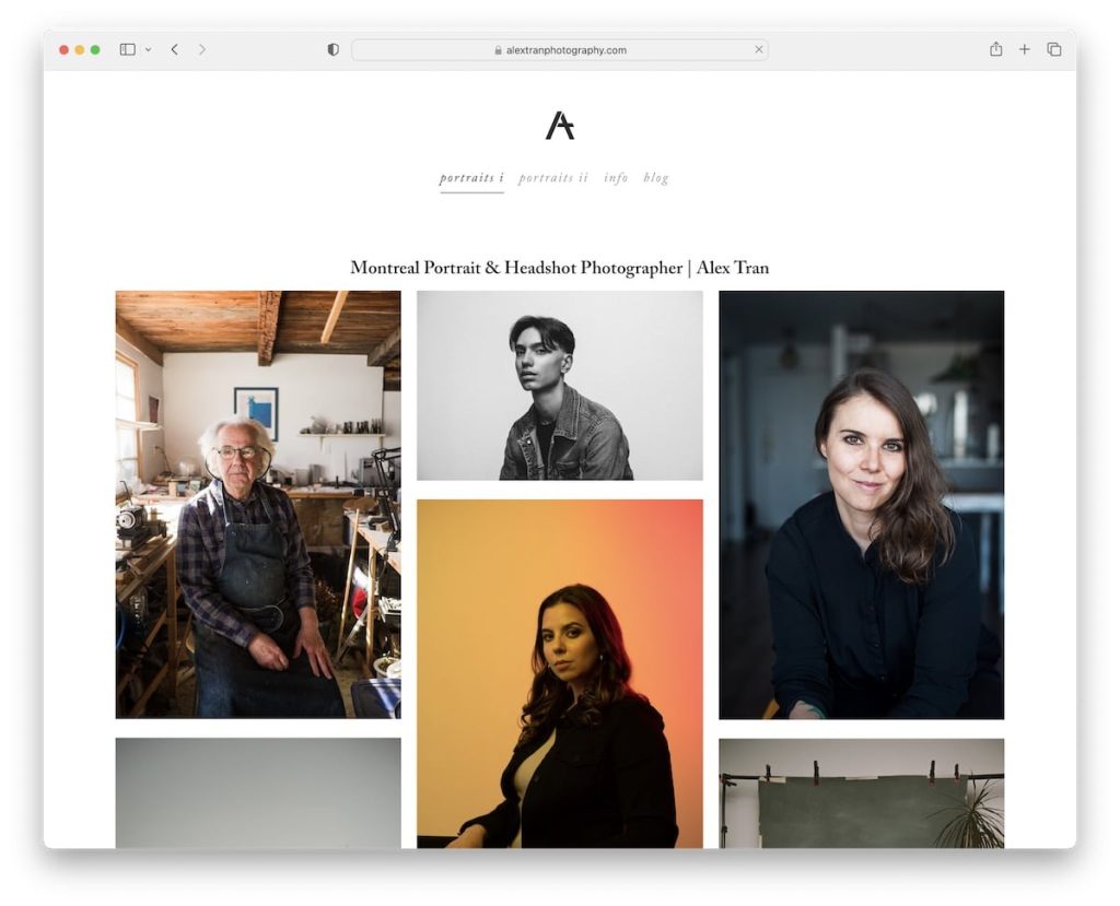
This Squarespace website by Alex Tran breaks the mold for photography portfolios. Instead of the typical hero image or portfolio grid at the top, Alex welcomes visitors with a clear title and a concise bio, followed by a unique three-column grid layout. The clean aesthetic extends to the bottom of the page, where the designer has opted to forgo a footer, further emphasizing a minimalist approach.
What truly elevates this site is its use of accordions. This space-saving feature allows visitors to delve deeper into specific projects without cluttering the main view. Additionally, Alex’s blog section adds a personal touch, fostering a deeper connection with potential clients.
Key takeaways:
- Hero area with a focus on you: Start with a strong introduction – tell visitors who you are and what you do before showcasing your work.
- Embrace minimalism: Consider a clean, uncluttered layout that prioritizes essential information and visuals.
- Blog for connection: Use a blog to share insights, stories, and behind-the-scenes glimpses to build a personal brand.
What Makes a Winning Website Design?
The success of a website depends on factors other than looks. Stellar functionality is crucial too, but it’s the harmonious blend of both that truly elevates the user experience. An effective website empowers visitors to effortlessly find the information, products, or services they seek.
Think of it as a well-designed home. While visual appeal is important, an overly cluttered space can be overwhelming. Simplicity is key – clear pathways, intuitive navigation, and a focus on the essentials ensure a smooth and satisfying journey for visitors.
Here are some key ingredients to consider when crafting that winning website design:
- Prioritize User Experience: Put yourself in your visitors’ shoes. Anticipate their needs and make it easy for them to find what they’re looking for. Clear navigation, well-organized content, and a focus on usability are all essential elements.
- Embrace Minimalism: Resist the urge to clutter your website with unnecessary elements. Instead, prioritize clean layouts, ample white space, and a focus on high-quality visuals. A streamlined design fosters clarity and allows your content to truly shine.
- Strive for Balance: While functionality is paramount, don’t neglect visual appeal. A website should be aesthetically pleasing without sacrificing user-friendliness. High-quality imagery, a cohesive color scheme, and a touch of creativity can go a long way in creating a memorable first impression.
Conclusion
Still wrestling with website complexity? ONextDigital offers a knockout punch. Our UX/UI Design Service will deliver a website that’s as intuitive as it is beautiful. Combined with our Web Development Service, you’ll have a website that not only looks stunning but converts like a champ. Partner with ONextDigital and transform your online presence today! Contact us now.


