In today’s podcasting boom, where captivating voices vie for attention, a strong online presence is no longer a luxury, it’s a necessity. But your podcast website shouldn’t just be a digital trophy case for past episodes. It’s a dynamic hub designed to attract new listeners, cultivate a loyal fanbase, and even spark exciting collaborations.
Think of it as your podcast’s headquarters: a welcoming space that seamlessly connects curious minds with your latest episode, offers deeper dives into past discussions, and fosters a thriving community around your unique voice. New to podcasting or a seasoned pro, this guide will equip you with the knowledge you need. We’ll explore inspiring website examples from diverse genres, and delve into the essential elements that will help you showcase your voice and elevate your podcasting experience to new heights.
What is a Podcast Website?
Imagine a dedicated space online, a digital headquarters for your podcast. That’s the magic of a podcast website. It’s more than just a digital brochure; it’s a dynamic hub designed to:
- Captivate New Listeners: A website acts as your shop window, enticing potential listeners with a clear message about your show, captivating visuals, and easy access to your latest episode.
- Cultivate a Loyal Fanbase: Beyond episodes, your website offers a place for deeper engagement. Think blog posts that delve into podcast topics, transcripts for accessibility and SEO, or show notes with additional resources – all fostering a sense of community around your voice.
- Spark Exciting Collaborations: A well-crafted website showcases your professionalism and commitment to your craft. This can attract potential sponsors, collaborators, or even guests for future episodes, taking your podcast to the next level.
In essence, your podcast website is the bridge that connects your captivating voice with a world of curious listeners. It’s a platform to showcase your work, build a loyal following, and unlock new possibilities for your podcasting journey.
Essential Elements for a Podcast Website
1. Clear and Engaging Homepage:
Your homepage is the first impression for potential listeners, so make it count! Here’s what it should deliver:
- Hero Section: This is prime real estate, so use it to grab attention.
- Feature a captivating image or video related to your latest episode or overall theme.
- Include a clear and concise tagline that captures the essence of your podcast.
- Prominently display a call to action (CTA) button, encouraging visitors to subscribe, listen to the latest episode, or explore your archive.
- Easy Navigation: Make it simple for visitors to find what they’re looking for.
- Utilize a clear and intuitive navigation bar with key sections like “About Us,” “Episodes,” “Blog” (if applicable), and “Contact.”
- Consider a search bar for those who know exactly what they’re looking for (e.g., a specific episode title or guest name).
2. Compelling Episode Listings:
Your episodes are the heart of your podcast, so showcase them in a way that entices listeners to dive in.
- Organized and User-Friendly Episode List:
- Present your episodes in a clear chronological order (newest to oldest) or categorized by season or theme if applicable.
- Utilize captivating thumbnails or short video previews to visually represent each episode.
- Informative Descriptions:
- Craft compelling episode descriptions that succinctly convey the main topic and pique listener interest.
- Include keywords relevant to your content to improve search engine optimization (SEO).
- Briefly mention any guest speakers or notable discussions to add depth.
- Streamlined Listening Experience:
- Integrate a direct podcast player onto your website, allowing visitors to listen directly without leaving the page.
- If you don’t host your podcast directly on your website, ensure clear and prominent links to major streaming platforms like Apple Podcasts, Spotify, or Google Podcasts.
3. Engaging Content Beyond Episodes:
While episodes are the core, your website can offer a wealth of additional content to build a loyal following.
- Blog Posts:
- Publish blog posts related to your podcast topics.
- This can be a great way to delve deeper into specific aspects discussed in your episodes, offer additional resources, or share listener insights.
- Regularly updated blog content keeps your website fresh and encourages repeat visitors.
- Transcripts and Show Notes:
- Provide transcripts of your episodes to improve accessibility for hearing-impaired listeners and for those who prefer to read.
- Offer show notes that expand upon topics mentioned in the episode, including links to resources, websites, or books discussed.
- Transcripts and show notes also boost SEO by adding relevant keywords to your website content.
Common Mistakes to Avoid When Building a Podcast Website
1. Neglecting Mobile Optimization:
In today’s mobile-first world, a website that isn’t responsive is a lost opportunity. Here’s how to avoid this pitfall:
- Test on Different Devices: Don’t just assume your website looks good – actively test it on desktops, tablets, and smartphones of various screen sizes.
- Prioritize Responsive Design: Choose a website builder or theme that automatically adjusts layouts for optimal viewing on any device.
- Focus on Easy Navigation: Ensure menus and buttons are large enough for easy tapping on touchscreens.
- Optimize Images: Use images that are sized appropriately for mobile viewing and compress them to avoid slow loading times.
2. Content Overload:
While content is valuable, overwhelming visitors can backfire. Here’s how to strike a balance:
- Prioritize Clarity: Break down complex information into easily digestible chunks.
- Utilize White Space: Don’t cram too much text or visual elements onto a single page.
- Categorize Content: Organize your episodes and blog posts logically with clear categories or tags to help visitors find specific information quickly.
- Focus on User Experience (UX): Design your website with user experience in mind. Make it intuitive and easy for visitors to navigate without getting lost.
3. Inconsistent Branding:
Branding consistency builds recognition and professionalism. Here’s how to maintain it:
- Develop a Brand Style Guide: Create a document outlining your logo, color palette, fonts, and overall visual style. This ensures consistency across all platforms.
- Template Consistency: If using a website builder with templates, choose one that aligns with your overall brand aesthetic.
- Social Media Integration: Ensure your website reflects the look and feel of your social media profiles. Use the same logo, colors, and fonts.
4. Forgetting Analytics:
Website analytics are your secret weapon. Here’s how to leverage them:
- Choose Analytics Tools: Integrate website analytics tools like Google Analytics to track visitor behavior.
- Monitor Key Metrics: Track metrics like page views, visitor demographics, and popular content to understand your audience better.
- Identify Areas for Improvement: Use analytics data to identify sections with high bounce rates or low engagement and make informed decisions for improvement.
5. Ignoring SEO:
Search Engine Optimization (SEO) helps listeners discover your podcast. Here’s how to get started:
- Keyword Research: Identify relevant keywords that potential listeners might use to search for podcasts related to your topic.
- Optimize Content: Incorporate target keywords naturally throughout your website content, including episode descriptions, blog posts, and page titles.
- Meta Descriptions: Craft compelling meta descriptions for each page that entice searchers to click through.
- Backlink Building: Over time, strive to build backlinks from other relevant websites in your niche. This signals to search engines that your website is a valuable resource.
Inspiring Podcast Website Examples:
Let’s delve into a diverse range of podcast websites that showcase exceptional design and functionality:
1. 99% Invisible:
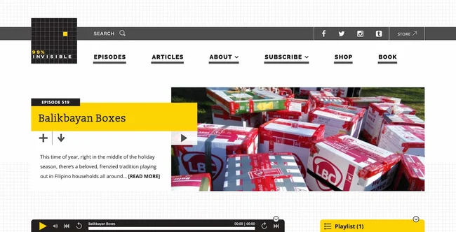
Known for its exploration of the unseen design forces that shape our world, 99% Invisible’s website reflects this theme with a clean and minimalist aesthetic. The homepage features a captivating hero image related to the latest episode, alongside a clear CTA button to “Listen Now.” Easy navigation allows visitors to delve into past episodes, explore articles, and learn more about the show’s creators.
2. This American Life:
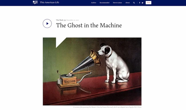
This American Life, a powerhouse in narrative journalism, utilizes its website to showcase the emotional depth of its storytelling. The homepage features impactful audio clips and video snippets from recent episodes, immediately drawing visitors into the world of the show. A well-organized archive section allows users to browse by episode theme or guest speaker.
3. Serial:
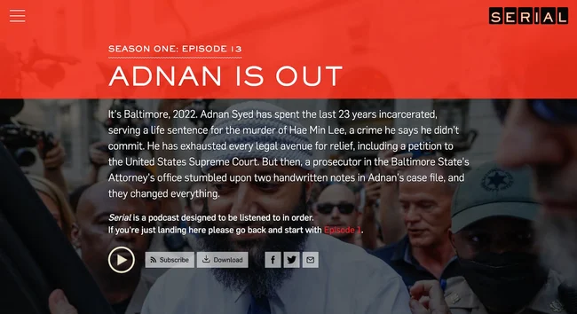
Serial, the podcast that redefined investigative journalism in the podcasting age, uses its website as a companion piece to its gripping stories. The homepage features a prominent timeline showcasing the key events explored in the first season, allowing listeners to revisit details or catch up before diving into new seasons.
4. CTRL SHIFT:
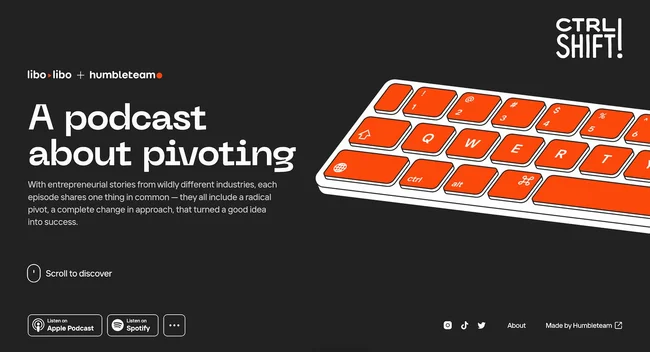
CTRL SHIFT tackles the ever-evolving world of business and technology. Their website reflects this focus with a modern and dynamic design. The homepage features a rotating carousel showcasing recent episode topics, alongside a prominent “Subscribe” button to capture new listeners. Interactive elements, like polls and quizzes related to the latest episode, further engage visitors and foster a sense of community.
5. Side Hustle Pro:
Side Hustle Pro empowers listeners to turn their passions into profitable side hustles. Their website reflects this spirit with a bright and energetic aesthetic. The homepage features clear calls to action for downloading their free guide or subscribing to their email list. Prominent sections showcase success stories from past guests, inspiring visitors to embark on their own entrepreneurial journeys.
6. Finding Founders:
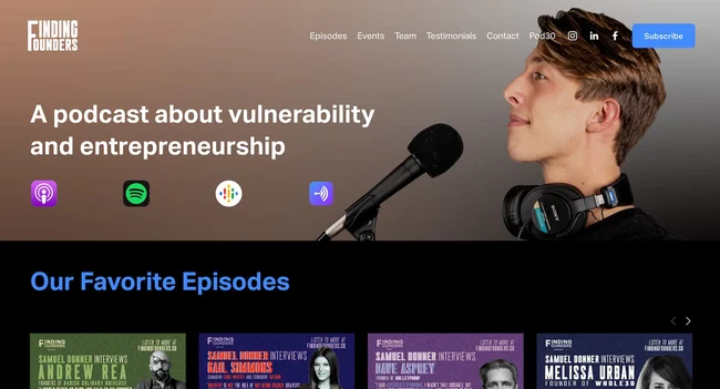
Finding Founders dives deep into the journeys of successful startup founders. Their website takes a professional yet approachable tone. The homepage features a clean layout with a prominent “Listen Now” button and clear navigation to explore past episodes, guest profiles, and investment resources. Informative blog posts delve deeper into topics discussed on the podcast, offering additional value to listeners.
7. Call Your Girlfriend:
Call Your Girlfriend tackles pop culture and relationships with a witty and insightful perspective. Their website reflects this playful yet thoughtful approach. The homepage features a vibrant color scheme and engaging graphics. Podcast summaries are infused with humor and personality, enticing listeners to tune in. A dedicated “Community” section fosters interaction between listeners with features like discussion forums and fan art galleries.
8. Nudge:
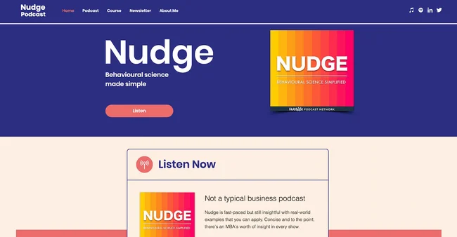
Nudge explores the fascinating world of behavioral science and its applications in everyday life. Their website prioritizes clarity and information. The homepage features a well-organized layout with sections dedicated to explaining the science behind the podcast’s topics. Listeners can explore past episodes categorized by theme, delve into show notes with additional resources, and even sign up for a newsletter featuring exclusive content.
9. S-Town:
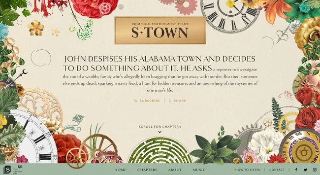
S-Town, a captivating investigative journalism podcast, utilizes a minimalist website design that doesn’t detract from the power of its storytelling. The homepage features a single, captivating image related to the central mystery, alongside a prominent “Listen Now” button. Limited text piques visitor curiosity without revealing too much.
10. Radiolab:
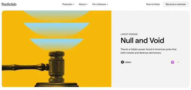
Radiolab, known for its innovative and engaging exploration of science and technology, boasts a website that reflects its creative spirit. The homepage features a dynamic layout with interactive elements and playful animations. Each episode is presented with a unique visual identity, mirroring the creative energy of the podcast itself. In-depth show notes and blog posts offer additional details and resources for curious listeners.
Conclusion
Just like your podcast grew from humble beginnings, your website can too. Even if you’re starting with a shoestring budget, ONextDigital can help you launch a website that punches above its weight. We offer a range of web development services that are perfect for podcasters on the rise.
Here’s the magic: we don’t believe in a one-size-fits-all approach. Whether you need a simple, mobile-friendly website to showcase your latest episode or a feature-rich platform with custom functionalities like episode transcripts or listener feedback tools, ONextDigital will work with you to design a solution that perfectly complements your podcast and grows with your audience.
So ditch the cookie-cutter templates and generic website builders. With ONextDigital’s expert web development services, you can launch a website that reflects your unique voice, keeps your audience engaged, and helps your podcast climb the charts. Contact us today.


