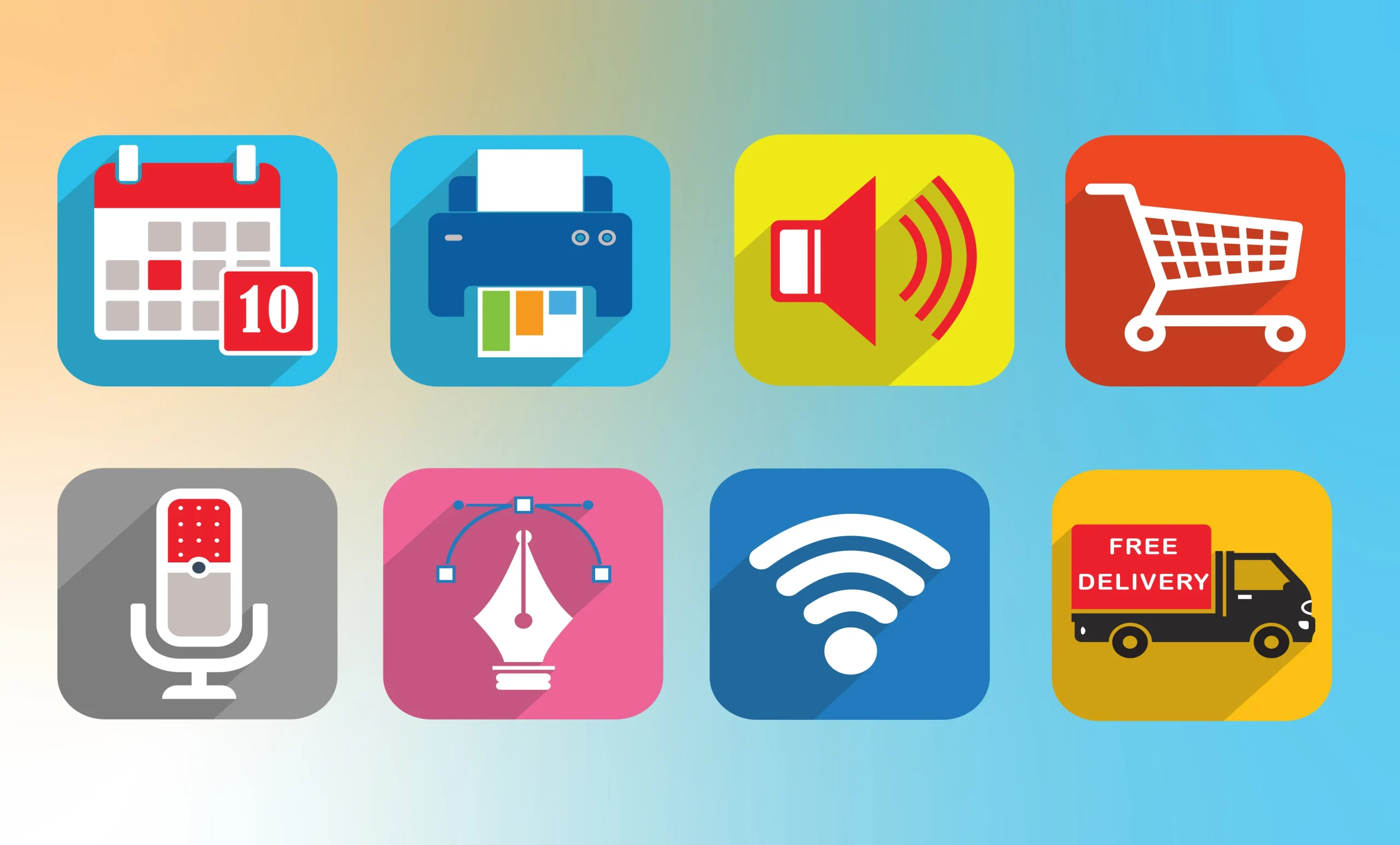
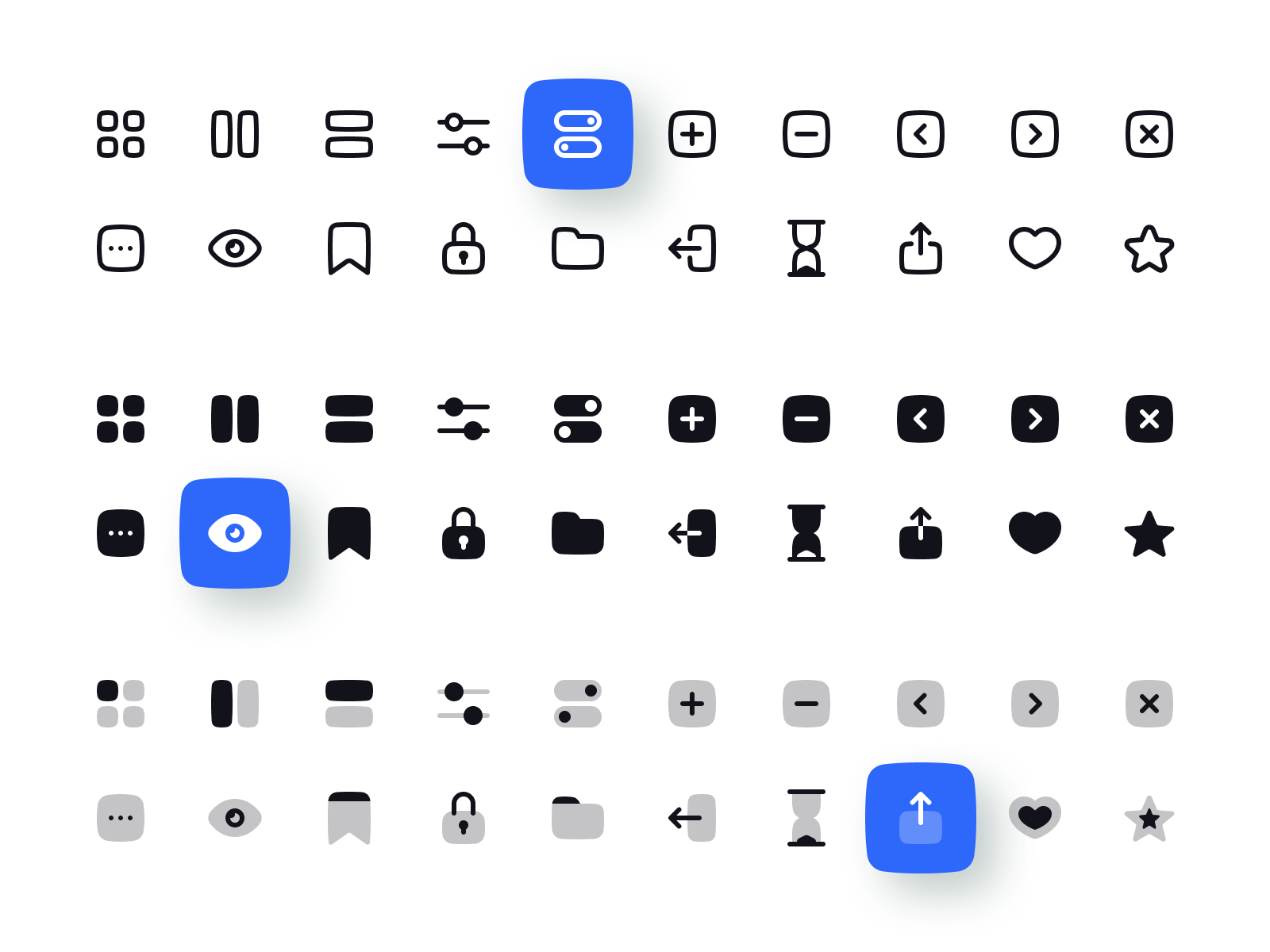
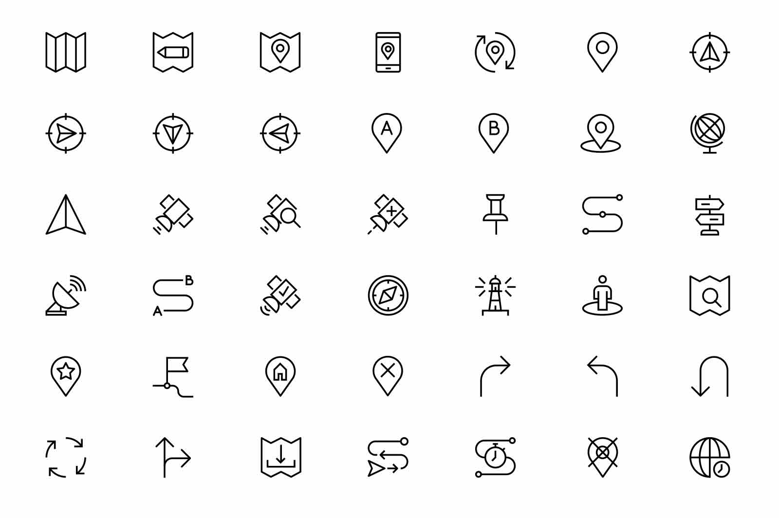
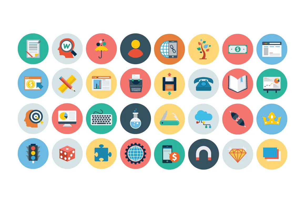
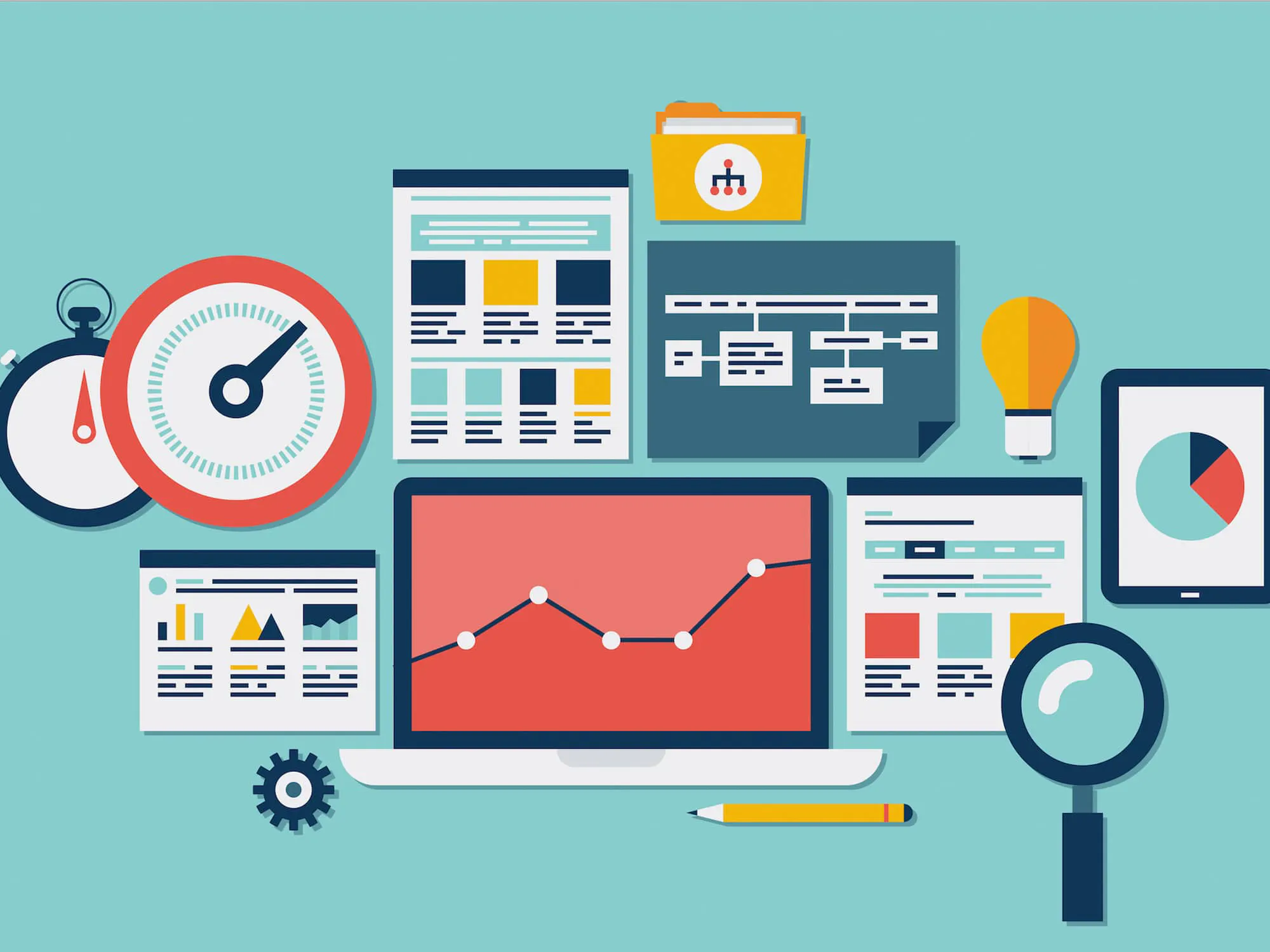
In the ever-evolving digital realm, where user experience reigns supreme, Web Design Icons have become indispensable tools for designers and developers alike. These graphical symbols not only enhance the visual appeal of websites and mobile apps but also play a vital role in conveying complex ideas with simplicity.
What are the Web Design Icons?
Web Design Icons are graphical symbols representing different aspects of web design, usable in web design, mobile apps, and presentations. They depict concepts like UI elements, UX processes, and SEO. These icons come in formats like SVG, PSD, PNG, EPS, and ICON FONT, designed to seamlessly integrate into your projects.
The role of Web Design Icons
The role of Web Design Icons is pivotal in shaping seamless digital interactions for users across websites and mobile applications. These graphical symbols serve as intuitive navigational aids, guiding users through complex interfaces with ease and efficiency. Here’s a closer look at their crucial roles:
1. Enhancing User Experience:
Web Design Icons enhance the overall user experience by providing visual cues for different functions and actions. Users can quickly identify and comprehend specific features, such as search, settings, or navigation menus, thanks to these icons. By simplifying the understanding of interface elements, icons contribute significantly to user satisfaction and usability.
2. Providing Universal Language:
Icons offer a universal language that transcends linguistic and cultural barriers. A well-designed magnifying glass universally signifies search, and a trash bin icon represents deletion. This consistency ensures that users, regardless of their language or location, can easily understand and interact with digital platforms, fostering inclusivity and accessibility.
3. Improving Cognitive Load:
Icons reduce cognitive load by replacing lengthy textual labels with concise visual representations. Users can process and recognize icons more quickly than reading text, making interactions more efficient. By streamlining the user’s decision-making process, icons contribute to a more intuitive and user-friendly interface.
4. Creating Visual Hierarchy:
Web Design Icons aid in establishing visual hierarchy within a webpage or app interface. They draw attention to essential elements and actions, guiding users toward key features and enhancing the overall flow of the user journey. Icons help organize content, making it easier for users to prioritize information and navigate effectively.
5. Reinforcing Brand Identity:
Icons can be designed to reflect the brand’s visual identity, incorporating specific colors, styles, or themes. Consistent use of branded icons reinforces brand recognition and strengthens the overall brand identity. This cohesive visual language fosters trust and loyalty among users, enhancing the brand’s presence in the digital landscape.
6. Enhancing Interactivity and Feedback:
Interactive icons provide feedback to users, indicating actions like hovering or clicking. For example, a color change or animation when hovering over a button icon confirms its interactivity. This feedback loop enhances user engagement, making interactions more engaging and responsive, ultimately improving the overall user experience.
Different Types of Web Design Icons
Web Design Icons come in various categories, each serving a specific purpose in enhancing user experience and visual communication. Here are the different types of web design icons commonly used in digital interfaces:
1. User Interface (UI) Icons:
icons represent interactive elements within a user interface, such as buttons, menus, and input fields. These icons make it easy for users to identify and interact with different features, enhancing the overall usability of websites and applications.
Examples: Home button, settings gear, heart symbol for favorites, and envelope icon for emails.
2. User Experience (UX) Icons:
UX icons illustrate different processes and actions, providing users with feedback on their interactions. These icons are essential for conveying loading states, success messages, errors, and other dynamic elements, ensuring a smooth and informative user experience.
Examples: Loading spinner, checkmark for successful actions, warning triangle for errors, and refresh icon for reloading content.
3. Navigation Icons:
Navigation icons guide users through websites and apps, helping them move from one page to another or explore specific sections. These icons create a clear pathway, improving the overall navigation flow and making it easier for users to find the information they seek.
Examples: Arrow icons for navigation (left, right, up, down), menu icon for opening navigation menus, and breadcrumb icons for hierarchical navigation.
4. Action Icons:
Action icons represent specific actions or functionalities that users can perform within an interface. These icons prompt users to interact, encouraging them to click, submit, save, or share content, among other actions, enhancing user engagement.
Examples: Plus sign for adding, trash bin for deleting, pencil for editing, and share icon for social media sharing.
5. Social Media Icons:
Social media icons represent various social platforms and enable users to connect with a website or application’s social media profiles. These icons facilitate social sharing, expanding a website’s reach and fostering community engagement.
Examples: Facebook, Twitter, Instagram, LinkedIn, and YouTube icons.
6. SEO Icons:
SEO icons symbolize search engine optimization concepts and tools, indicating elements related to website rankings, keywords, analytics, and online visibility. These icons are valuable for digital marketers and website administrators.
Examples: Magnifying glass for search, bar chart for analytics, target for keywords, and globe for global reach.
Formats and Accessibility
Formats of Web Design Icons
Web Design Icons are available in various formats, each catering to different design needs and technical requirements. Understanding these formats is essential for designers to choose the right type of icon for their projects:
1. Scalable Vector Graphics (SVG):
– Advantages: SVG icons are resolution-independent and can be scaled to any size without losing quality. They are ideal for responsive web design and high-resolution displays.
– Common Use: SVG icons are widely used in websites and mobile apps, providing crisp visuals on different devices.
2. Portable Network Graphics (PNG):
– Advantages: PNG icons support transparent backgrounds and offer high-quality images. They are suitable for icons with complex designs and detailed graphics.
– Common Use: PNG icons are commonly used for logos, small-sized icons, and illustrations in web design.
3. Photoshop (PSD) Files:
– Advantages: PSD files provide editable layers, allowing designers to customize icons easily. They are suitable for projects that require extensive modifications.
– Common Use: PSD files are popular among graphic designers for creating intricate icons and designs.
4. Encapsulated PostScript (EPS):
– Advantages: EPS icons are vector-based and can be resized without loss of quality. They are widely used in print materials and professional graphic design projects.
– Common Use: EPS icons are suitable for projects that require high-quality print output, such as brochures and posters.
5. Icon Font:
– Advantages: Icon fonts are a collection of vector icons stored as font files. They offer flexibility in terms of size, color, and effects. They are compatible with CSS, allowing easy styling and customization.
– Common Use: Icon fonts are commonly used in web development for scalable and customizable icons, ensuring consistent design across various devices.
Accessibility of Web Design Icons
Ensuring the accessibility of web design icons is crucial to providing an inclusive user experience for all individuals, including those with disabilities. Here are essential considerations for making icons accessible:
1. Alternative Text (Alt Text):
– Provide descriptive alternative text for each icon. Screen readers use this text to convey the meaning of the icon to users with visual impairments.
2. Color Contrast:
– Ensure sufficient contrast between icon colors and the background to make icons visible and distinguishable, especially for users with color vision deficiencies.
3. Focus States:
– Implement clear focus states for interactive icons. Users navigating with keyboard input should be able to identify and interact with icons easily.
4. Keyboard Accessibility:
– Ensure icons are keyboard accessible, allowing users to navigate and interact with icons using keyboard shortcuts and tab keys.
5. ARIA Roles and Attributes:
– Use Accessible Rich Internet Applications (ARIA) roles and attributes to enhance the accessibility of interactive icons, providing additional information to assistive technologies.
Conclusion
Web Design Icons are more than mere embellishments; they are powerful tools that bridge the gap between users and digital interfaces. By embracing the right icons in the appropriate contexts, designers enhance user experience, ensuring seamless navigation and effective communication. As technology continues to advance, the role of Web Design Icons will only become more significant, shaping the future of digital interactions.
At OnextDigital, we take pride in our decade-long expertise in UX/UI Design and our commitment to creating visually captivating and highly functional websites. If you want more information, contact us now.
