Over one million small and mid-sized businesses are already selling on Amazon, but only a few truly stand out. Creating the Best Amazon Store front can help you showcase your brand, engage more customers, and increase sales.
In this guide, we’ll walk you through how to set up a professional Amazon Storefront and highlight eight of the Best Amazon Store front examples from top-selling brands. You’ll discover different design styles, layouts, and strategies that make these stores successful and inspiring.
Whether you’re new to Amazon or looking to improve your store, our marketing resources offer practical tips and step-by-step guidance to help your Storefront shine and reach more potential customers.
What are Amazon Storefronts?
Amazon Storefronts are like mini websites for your brand, right inside Amazon. They let businesses showcase their products, collections, and overall brand style in one place more engaging than a regular product page.
With a Storefront, you can customize the layout, add banners, organize products into categories, and highlight featured items. This gives shoppers a smoother, more enjoyable browsing experience and helps your brand stand out.
Storefronts also give you tools to track how visitors interact with your page, which can help you understand what works and make smarter decisions to boost sales.
In short, an Amazon Storefront helps you tell your brand’s story, create a polished shopping experience, and reach more customers effectively on Amazon.
How to Build an Amazon Storefront That Actually Works
Creating an Amazon Storefront is more than just putting your products online it’s about telling your brand’s story, guiding customers through your offerings, and giving them a reason to buy from you instead of a competitor. Here’s a detailed, step-by-step guide that combines practical steps with insight into why each one matters:
1. Enroll in Amazon Brand Registry (if you have a brand)
Joining the Brand Registry isn’t just a formality. It protects your intellectual property and gives you access to enhanced tools for building a professional Storefront. Brands in the registry can create custom pages, showcase their collections, and highlight brand values, which helps shoppers trust and connect with your products.
2. Log in to Seller Central
Your Seller Central account is your control center. Beyond uploading products, this is where you’ll manage your Storefront, monitor analytics, and tweak layouts. If you’re new, take time to explore Seller Central understanding its features will save you headaches later.
3. Navigate to the “Stores” Section
Under the “Advertising” tab, you’ll find “Stores.” This is where you start designing your Storefront. It’s worth exploring the templates and tools here before you begin, so you know what’s possible.
4. Choose a Template That Fits Your Brand
Amazon offers a few layout options, from simple grids to more dynamic, modular designs. Choose one that matches your brand’s style and the way you want customers to experience your products. A clean, intuitive layout can dramatically improve navigation and keep shoppers engaged.
5. Customize Your Storefront Thoughtfully
This is where your brand comes alive. Use:
- Visual hierarchy: Highlight bestsellers or seasonal collections at the top.
- Consistent branding: Stick to your logo, colors, and fonts.
- Compelling copy: Use short, benefit-focused product descriptions rather than generic phrases.
Each choice affects how easily customers understand your brand and make purchase decisions. A well-organized, visually appealing store reduces friction and builds trust.
6. Organize Products Strategically
Group items into clear categories or collections. Avoid overwhelming customers with too many choices at once. Think about their shopping journey what would they want to see first, and how can you guide them to complementary products? Strategic product placement can increase cross-selling opportunities.
7. Leverage Content Pages
Amazon allows you to create content pages for storytelling, tutorials, or lifestyle inspiration. For example, a skincare brand might include a page explaining routines and product combinations. These pages don’t just inform they engage shoppers, help build your brand personality, and differentiate you from competitors.
8. Preview, Test, and Publish
Before going live, navigate your Storefront as if you were a customer. Check visuals, links, and readability. Testing ensures your store is polished, professional, and user-friendly. Once everything looks right, hit “Publish.”
9. Promote Your Storefront Across Channels
A beautiful Storefront won’t attract visitors on its own. Share it on social media, include it in email campaigns, and consider Amazon ads. Highlight promotions or seasonal collections to drive traffic and increase conversion rates.
10. Monitor Performance and Optimize Regularly
Amazon provides analytics showing which pages and products get clicks, where visitors spend time, and what drives purchases. Use these insights to tweak content, rearrange featured products, or test new visuals. Regular optimization keeps your Storefront effective and ensures your sales continue growing over time.
Top 8 Best Amazon Store front Examples
1. Reebok’s Amazon Storefront
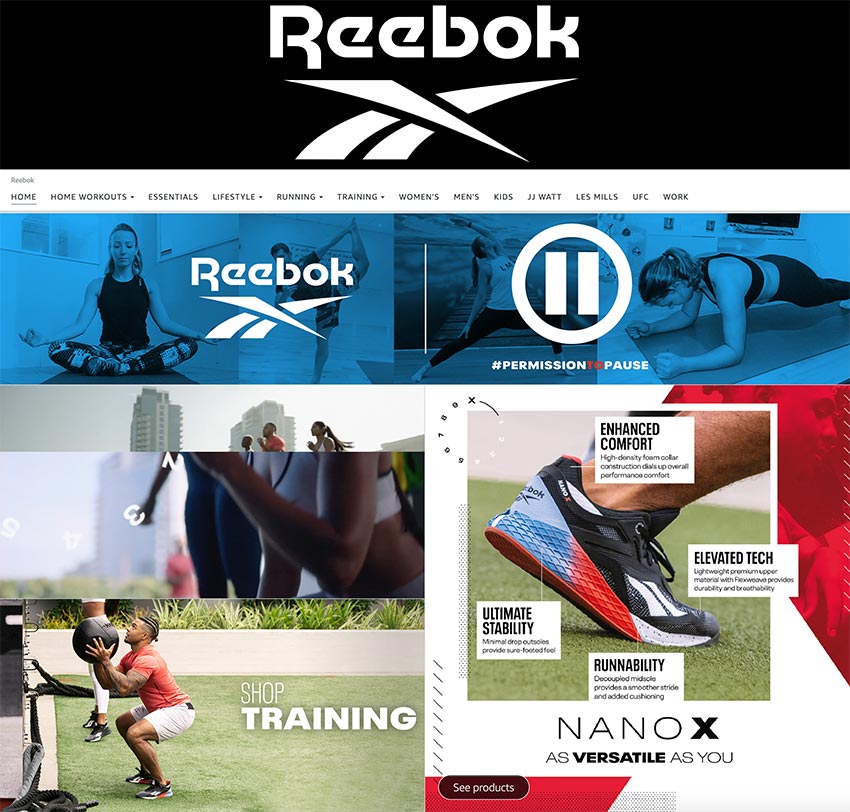
Reebok, being a renowned global fitness brand, understands the importance of an attention-grabbing Amazon storefront that reflects their iconic presence. Consequently, they crafted a standout design, excelling in fashion and across the platform.
On the store homepage, shoppers are captivated by Reebok’s immersive world, with lifestyle images and videos of athletes in training.
Dynamic visuals like bouncing feet and powerful weightlifting stances create a compelling connection between Reebok’s products and customers’ experiences.
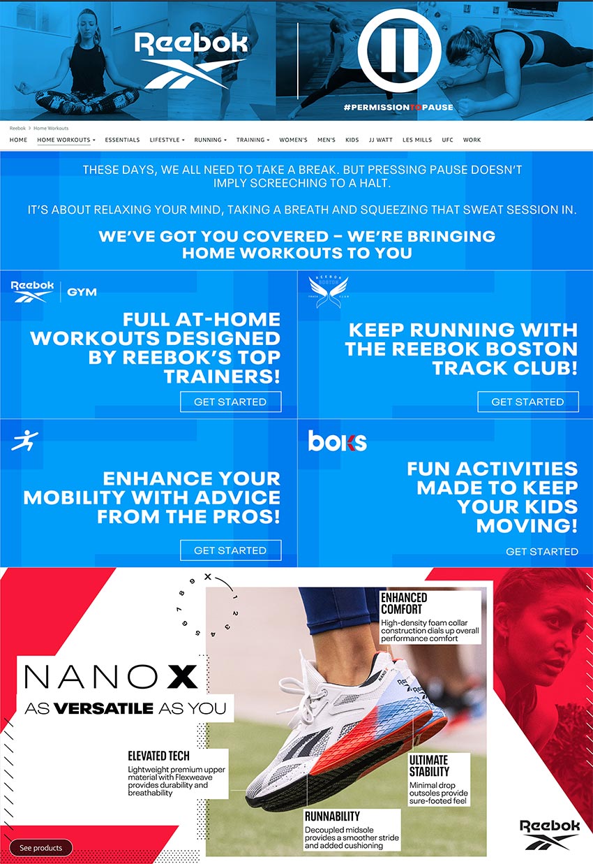
In order to showcase their latest shoe, the NANO X, Reebok employs large and polished graphics that draw immediate attention. When customers click on these promotional graphics, a pop-up is triggered, presenting various buying options. This strategic move effectively keeps the customer engaged and immersed within the storefront, streamlining their shopping experience.
Reebok’s banner highlights their marketing campaign, #PermissionToPause, offering free home-workout classes and health tips for customers. Clicking the banner leads to a personalized page with captivating content and related products for easy exploration and purchase. This integration allows customers to access valuable resources while exploring and buying relevant Reebok products.
Customers easily explore products by category using the navigation bar on the homepage, ensuring a seamless experience.
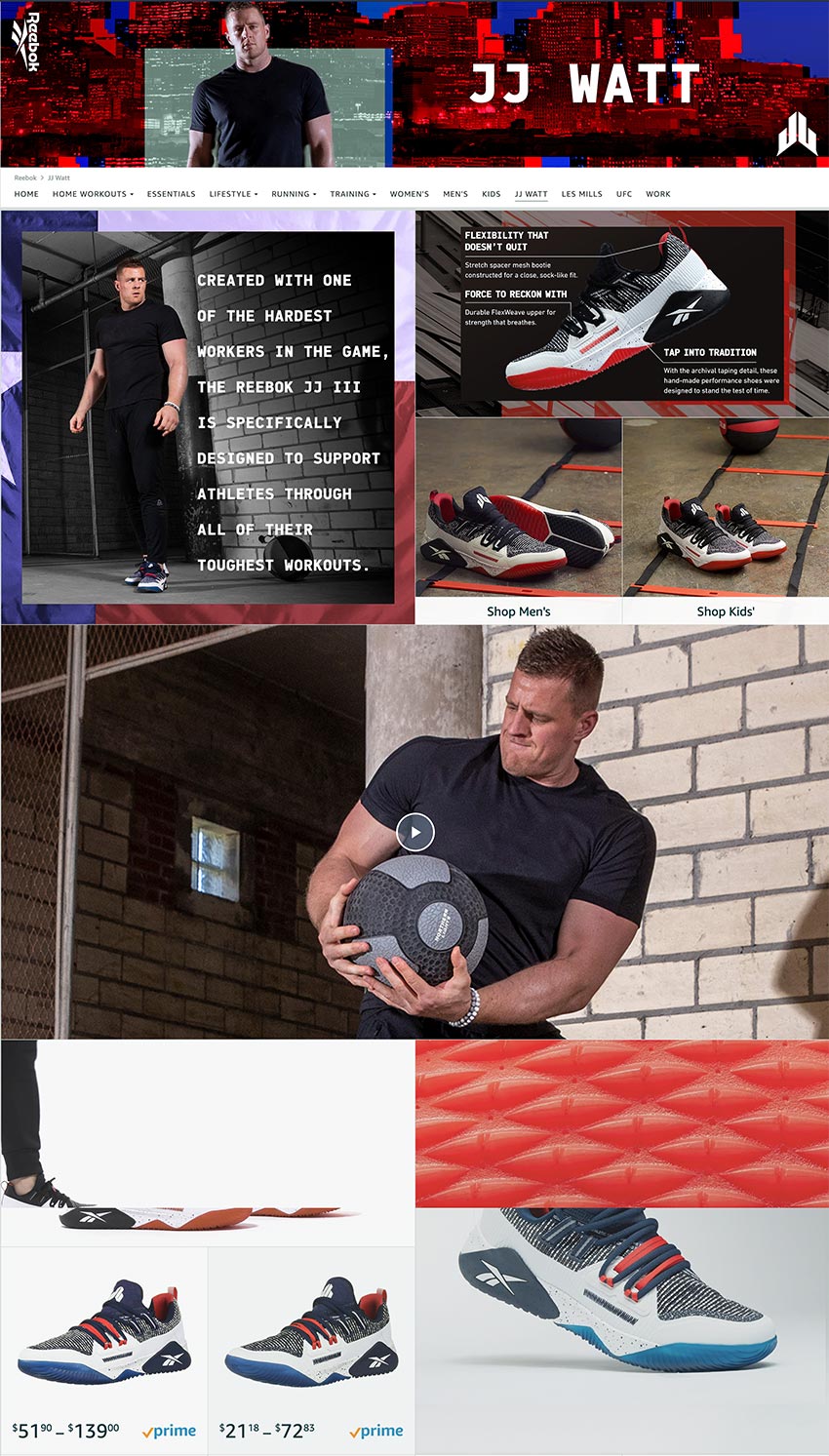
Subpages like “Women’s,” “Men’s,” and “Kids” offer direct access to product listings, allowing Reebok to rotate seasonal products smoothly.
Subpages for “JJ Watt” and “UFC” showcase lifestyle images and relevant products, creating an engaging customer experience.
2. Honest Co. Amazon Store
In 2011, Jessica Alba founded The Honest Company, known as Honest Co., emphasizing gentle, high-quality products. In 12 years, it became a household name.
Honest Co. displays a diverse range of baby care products on their website, catering to busy parents. A visually captivating banner presents adult-oriented products, including a special Registry option for expectant parents.
Crucially, Honest Co. maintains a strong brand message across marketing, including their Amazon Store, amidst gaining popularity.
3. Callaway
Leading our list of top Amazon Storefronts is Callaway, the renowned golf retailer, whose storefront is designed with exceptional user-friendliness. Navigating through their storefront is a breeze, allowing users to swiftly discover the golf products they seek. Upon entering the store, the brand’s logo stands out as the cover photo, creating an instant sense of brand recognition.
Establishing strong brand recognition is paramount in driving sales. Familiarity with your brand boosts trust and encourages purchases as it influences consumer decision-making positively.
Callaway’s Storefront has a user-friendly navigation bar, helping users find relevant pages for golf balls and bags easily. The homepage of Callaway’s Storefront proudly showcases a diverse range of products they have available for sale.
Callaway’s Amazon Storefront stands out as a prime example of excellence for several reasons:
- User-Friendly Navigation:.
- Extensive Product Showcase:
- High-Quality Visuals:
- Organized Navigation Bar:
4. Beats Amazon Store
Becoming synonymous with high-quality headphones, Beats emerged on the scene in 2006, thanks to Dr. Dre and Jimmy Iovine. From that point on, they became a true icon in the audio industry.
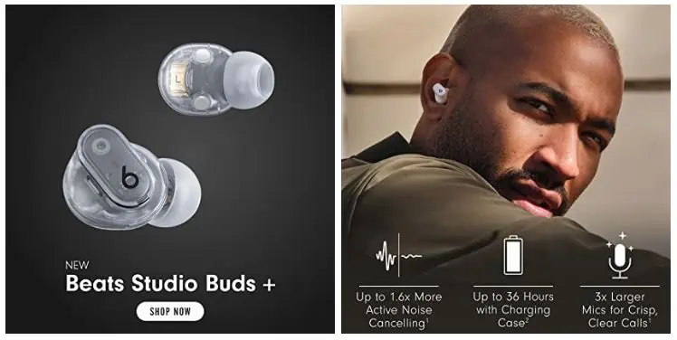
Their Amazon Storefront is a testament to their expertise, showcasing not only their music prowess but also their understanding of seamless design. Navigating through their Storefront is as effortless as finding a favorite song in your playlist. As soon as you land on their page, Beats strategically utilizes prime above-the-fold real estate to highlight one of their latest products, the Beats Studio Buds+. Following this, clear and clickable images lead customers to top categories, allowing them to easily explore and access all their offerings, including in-ear, over-ear, on-ear, and wireless headphones and earbuds.
Beats ensure a seamless shopping experience by presenting essential product specifications for easy comparison through images on their Storefront. To delve deeper into the technology’s intricacies, they offer informative videos that users can rely on for additional insights once they have narrowed down their options.
5. Sperry
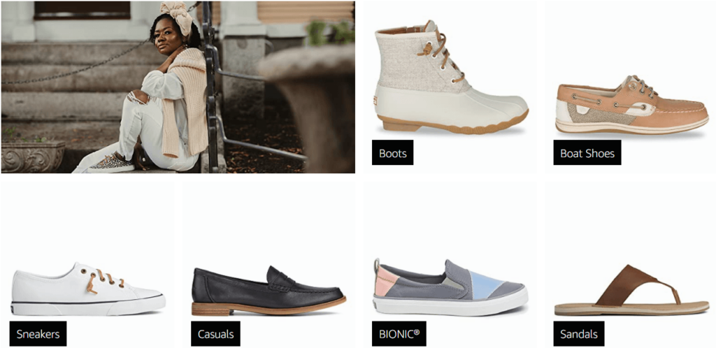
Claiming its place on our list of top Amazon storefronts is Sperry. At the very top of their Storefront, Sperry delights their loyal fans and entices new shoppers by prominently featuring their products and logo. The home page of Sperry’s Amazon Storefront offers convenient product categories, including women’s and men’s, with separate sections dedicated to their popular boots.
The aesthetics of the page are striking, characterized by a consistent image style and symmetrical arrangement that pleases the eye. Sperry’s Storefront stands as one of the finest Amazon store examples due to the following reasons:
- Aesthetic Cohesion: Sperry’s Storefront features curated photos with a warm, earthy aesthetic, reinforcing their brand identity throughout the store.
- User-Friendly Organization: Navigating through Sperry’s store is a breeze, as they thoughtfully categorize and organize their products to facilitate easy browsing. Shoppers can easily find specific shoe styles, and gender-specific items, or explore both options seamlessly.
Overall, Sperry’s Amazon Storefront shines as an exemplar of effective branding, coherent aesthetics, and user-centric organization, making it one of the best examples of a well-designed and engaging storefront on Amazon.
6. Adidas
Presenting itself on our list of top Amazon storefronts is Adidas. Their Storefront features a simple yet impactful cover photo, showcasing their iconic white logo against a black background. As you scroll down the page, you’ll be greeted with a series of photos that seamlessly blend with their aesthetic, effectively highlighting the various product categories they offer.
Adidas stands as one of the best Amazon storefront examples for two compelling reasons:
- Customized Cover Photos: Each category page boasts a cover photo that perfectly aligns with the content of that specific category. For instance, the golf category page features a cover photo with two golfers, ensuring shoppers can quickly confirm they are on the right page and find products relevant to their interests.
- User-Friendly Navigation: Adidas excels at providing an effortless shopping experience on their Amazon Storefront. The navigation is meticulously organized and thoughtfully categorizes products, streamlining the process for shoppers to swiftly locate the items they need.
In summary, Adidas’ Amazon Storefront stands out due to its custom cover photos and user-friendly navigation, making it a prime example of a well-designed and customer-focused storefront on Amazon.
7. Merrick Amazon Store Front
Recognizing the multitude of choices available to modern consumers, reputable pet food brands understand the significance of standing out in a competitive market. To establish a name for themselves, it is crucial that they offer nutritious food that pets will genuinely enjoy.
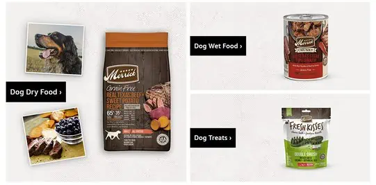
Merrick, as an example, highlights their commitment to pet well-being by collaborating with veterinarians, animal nutritionists, and scientists to create recipes that perfectly cater to pets’ needs. Instead of showcasing a background video module featuring the food itself, they cleverly prioritize adorable footage of playful pups and a leaping kitty, capturing attention and conveying the message that Merrick food is tailored to keep pets happy, healthy, and active. This emphasis on pet vitality reinforces the brand’s dedication to providing the necessary nutrition for pets to thrive and be their energetic best.
Continuing down the page, we notice how they have simplified the shopping process right from the home page, with products neatly organized into high-level categories. This user-friendly layout allows you to swiftly find the options that align with your specific interests. For those uncertain about where to begin, a dedicated “Best Sellers” section proves helpful, offering valuable insights.
Towards the end of their store homepage, attention is drawn to the essential elements of their food, particularly the comprehensive details of their 5-Star Promise. Accompanied by a “Learn More” button, visitors have the option to explore the full Merrick story and gain a deeper understanding of the brand’s commitment to quality and excellence.
8. Godiva’s Amazon Store front
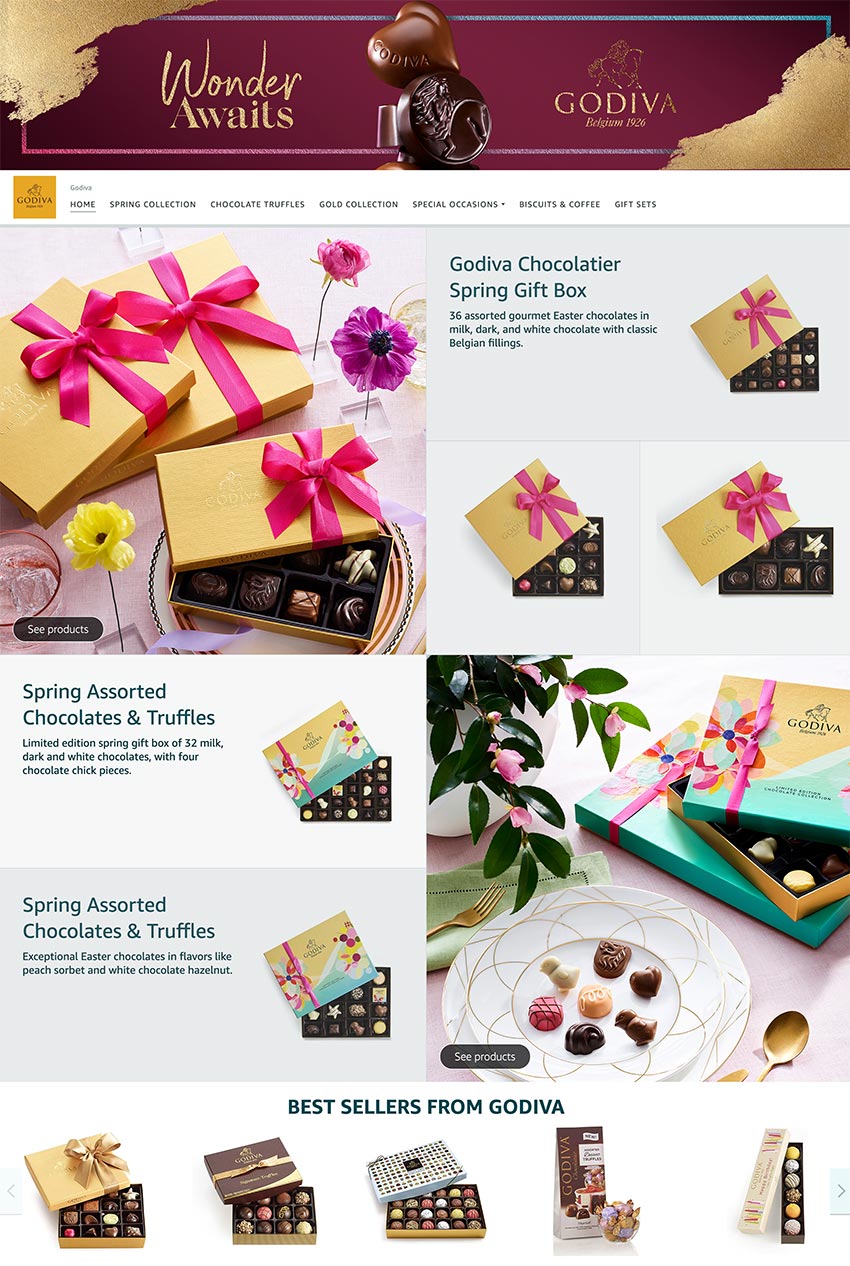
The renowned chocolate brand, Godiva, employs delectable visuals to allure shoppers into making a purchase. It’s hard to resist when the storefront is adorned with luxurious images of chocolates, precisely what customers anticipate from this esteemed brand. Each image is thoughtfully enhanced with small markers, allowing customers to hover their mouse over the products, granting them quick access to view the purchasing options available.
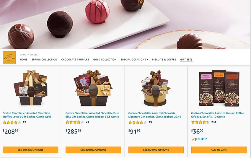
Within their Amazon store front, Godiva cleverly incorporates a dedicated section for gift boxes, strategically capitalizing on upsell opportunities not readily available on the Amazon search page. By offering bulk order options, Godiva entices customers to explore and indulge in larger purchase quantities, thereby maximizing their potential sales and providing a convenient solution for gift shopping.
Conclusion
Although brands cannot alter the overall look and feel of Amazon to align perfectly with their target customers, Amazon Stores offer an unparalleled opportunity to create a distinct and personalized space within the Amazon web. This dedicated corner is equipped with a plethora of appealing features that enable you to showcase your brand’s identity and place your customers’ priorities at the forefront.
If you have any concerns, contact us today for a chat! We’re here to assist you 24/7
Read more: 15 Stunning Surefire Squarespace Tattoo Websites For Design Inspiration
FAQs – Amazon Storefronts
Q1. What is an Amazon Storefront?
An Amazon Storefront is like a mini website for your brand within Amazon. It allows you to showcase your products, organize them into collections, and share your brand story all in one place.
Q2. Who can create an Amazon Storefront?
Any seller enrolled in the Amazon Brand Registry can create a Storefront, giving them access to customization tools and enhanced brand protection.
Q3. How much does it cost to set up an Amazon Storefront?
Creating a Storefront is free for sellers in Brand Registry, though investing in professional design or advertising can help maximize its impact.
Q4. How is a Storefront different from a regular product listing?
Unlike individual product listings, a Storefront focuses on your brand, allowing you to organize collections, highlight promotions, and tell your brand story.
Q5. Can I track performance on my Amazon Storefront?
Yes. Amazon provides analytics for Storefronts, including visitor traffic, clicks, and sales, so you can optimize your layout and content.
Q6. How can I drive traffic to my Amazon Storefront?
Promote your Storefront through social media, email campaigns, Amazon Sponsored Ads, and links from product listings to increase visibility and sales.


