The internet is a vast and wondrous place, a treasure trove of information and endless entertainment. But nestled amongst the informative articles and captivating cat videos lurk some truly bizarre creations: websites so poorly designed, they defy logic and leave you scratching your head. Welcome to the “Dumb Websites Hall of Shame,” a lighthearted exploration of the internet’s most questionable design choices!
Unveiling the Interwebs’ Gems of Questionable Design
Before we embark on this journey through comedic design disasters, let’s define what makes a website “dumb.” Think confusing navigation that sends visitors on a wild goose chase, color schemes that would make a clown cry, and stock photos so hilariously misplaced they become a meme in themselves. These websites might provide a good chuckle, but they also serve as a cautionary tale – a reminder of the importance of good website design in today’s digital world.
What Makes a Website “Dumb”?
Let’s delve into the hallmarks of a “dumb website”:
- Navigational Nightmares: Imagine a website where finding information feels like navigating a labyrinth blindfolded. Confusing layouts, missing menus, and broken links are the hallmarks of a “dumb website” navigation system, ensuring visitors leave more frustrated than informed.
- Eye-Strain Extravaganza: A website should be visually appealing, not an assault on the eyeballs. Clashing colors, illegible fonts, and an overwhelming amount of clutter are design sins that define the “dumb website” aesthetic.
- Stock Photo Shenanigans: Stock photos can be a valuable tool, but using them requires some finesse. A website featuring a photo of a businessman shaking hands with a stock image of a cat might be funny, but it definitely falls under the “dumb website” category.
- Content Calamity: Websites riddled with typos, grammatical errors, and nonsensical content are not only unprofessional but also leave a negative impression on visitors. A “dumb website” prioritizes quantity over quality when it comes to content.
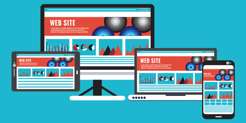
- Mobile Malaise: In today’s mobile-first world, a website that’s not optimized for smartphones and tablets is a major faux pas. Websites with text that’s too small to read or buttons that require pinpoint accuracy to click are prime examples of “dumb website” design in the mobile age.
10 Examples of Dumb Websites You Won’t Believe Exist
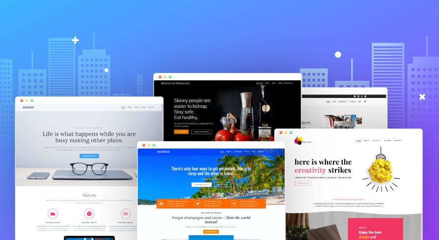
Prepare to be amazed (or perhaps horrified)! Here’s a curated list of 10 “dumb websites” that will have you shaking your head and wondering “who approved this?” Be sure to check out the accompanying screenshots for a visual feast (or nightmare) of questionable design choices.
1. The Disco Dentist:
Imagine a website promoting a dental practice with a flashing neon background, thumping disco music on autoplay, and animated teeth doing the floss dance. This website takes “fun and friendly” dental care a bit too far. While a lighthearted approach can be endearing, this website blasts past lighthearted and dives headfirst into sensory overload, potentially alienating visitors seeking a professional and calming dental experience.
2. Comic Sans Catastrophe: Law Edition:
A prestigious law firm website proudly displaying all legal documents in bright pink Comic Sans font? This website proves that font choice can have a dramatic impact on the perceived professionalism of your business. Comic Sans, with its playful and informal vibe, completely clashes with the seriousness and authority expected from a legal firm. Imagine trying to take a contract seriously when it’s presented in a font reminiscent of a birthday party invitation.
3. Stock Photo Hall of Fame (Mishap Edition):
A website selling high-end jewelry featuring a stock photo of a woman holding a magnifying glass to examine a single grain of rice? This website embodies the hilarious misuse of stock photos that can leave viewers scratching their heads. Stock photos can be valuable tools, but using them effectively requires relevance to the content. A diamond necklace deserves a photo showcasing its brilliance, not a woman inspecting a grain of rice!
4. Website Built for Giants (and Tiny Mice):
Imagine a website where the text is so small it requires a magnifying glass to read, buttons necessitate pinpoint accuracy to click, and the layout is designed for users with a wingspan of at least 6 feet. This website is a masterclass in how not to design for the average user. Responsive design is crucial in today’s mobile-first world. This website fails to adapt to different screen sizes, creating a frustrating experience for anyone not using a giant monitor.
5. Trapped in 1998: The Website Time Capsule:
Flashing text animations, a guest book begging for visitors to “sign my wall,” and a background image straight out of a 90s Geocities website? This website seems to have gotten lost in a time warp, highlighting the importance of keeping website design current with the times. While nostalgia can be a marketing strategy, this website takes it too far, leaving visitors feeling like they’ve stumbled upon a forgotten relic of the internet’s past.
6. The Unclickable Carousel:
A website featuring a beautiful product carousel that automatically rotates images every two seconds, with buttons strategically placed behind the images, making them impossible to click. This website exemplifies frustrating user experiences that can lead to lost sales. Product carousels are meant to showcase items and encourage clicks. This website completely undermines that purpose with its unintuitive design.
7. Pop-Up Palooza:
Imagine a website where a pop-up ad appears the moment you land on the homepage, followed by another pop-up offering a discount code, then another asking you to subscribe to their newsletter – all within the first 10 seconds. This website demonstrates how pop-ups, while valuable tools, can quickly become overwhelming and drive visitors away. Pop-ups can be effective for capturing leads, but bombarding visitors with them creates a sense of urgency and frustration, ultimately hindering the user experience.
8. The Broken Link Labyrinth:
A website with a seemingly well-designed layout but broken links scattered throughout, leading visitors to error pages or dead ends. This website frustrates visitors and hinders navigation, leaving them confused and unable to find the information they seek. Broken links not only create annoyance, but also damage your website’s credibility and search engine ranking.
9. The Mystery Meat Navigation:
A website with a navigation bar filled with cryptic icons and nonsensical menu labels like “The Fuzzy Wombat” and “Click Here for Fun!” This website fails to provide users with clear and intuitive navigation, leaving them unsure where to go and what to do. Effective navigation is the backbone of a user-friendly website. This website throws that principle out the window with its confusing and uninformative menu labels.
10. The Mobile Maze:
A website that looks stunning on a desktop computer but transforms into a confusing mess on a mobile device. Tiny buttons, unreadable text, and layouts that require horizontal scrolling – this website is a prime example of neglecting mobile-first design principles in today’s digital landscape. With the majority of web browsing happening on mobile devices, a website that fails to adapt is essentially invisible to a large portion of potential customers.
The Takeaway: Why Good Website Design Matters
Now that we’ve had a good laugh (or groan) at the expense of these “dumb websites,” let’s address the elephant in the room: website design truly matters. A poorly designed website can:
- Confuse and Frustrate Visitors: If users can’t find what they’re looking for or navigate your website with ease, they’ll likely click away and head to your competitor’s website.
- Damage Your Brand Image: A website is often the first impression potential customers have of your business. A “dumb website” screams unprofessionalism and can significantly damage your brand image.
- Hinder Conversions: Ultimately, the goal of most websites is to convert visitors into leads or paying customers. A website that’s difficult to use or visually unappealing will struggle to achieve those conversions.
On the contrary, investing in good website design offers a plethora of benefits:
- Improved User Experience: A well-designed website is intuitive to navigate, visually appealing, and provides a seamless user experience, keeping visitors engaged and happy.
- Enhanced Brand Credibility: A professional and well-designed website portrays your business as trustworthy and reliable, boosting brand credibility in the eyes of potential customers.
- Increased Lead Generation & Sales: A website that’s easy to use and optimized for conversions is more likely to convert visitors into leads and ultimately, paying customers.
Conclusion
The internet is a treasure trove of information and entertainment, but it also holds some truly bizarre creations – websites so poorly designed they defy logic. While these “dumb websites” provide a good laugh, they also serve as a cautionary tale. A well-designed website is crucial for any business in today’s digital world.
Don’t let your website become the next internet meme! At OnextDigital, we specialize in creating websites that are not only visually appealing but also user-friendly and optimized for conversions. Our team of web development and UX/UI design experts can help you craft a website that reflects your brand identity and achieves your business goals. Contact OnextDigital today for a free quote and let’s turn your website into a shining online success story!


