If you’re a designer, artist, architect, engineer, or part of any creative field, having a compelling portfolio is crucial for securing your dream job and attracting valuable clients. Your portfolio serves as a visual testament to your skills and plays a pivotal role in driving customers to your business. The power of a well-crafted and visually captivating portfolio cannot be overstated. Fortunately, there are several online platforms that offer an array of remarkable portfolio templates. Among these platforms, Squarespace stands out as an exceptional choice, offering effortless customization options for your portfolios. In this article, we have curated a collection of the finest Squarespace portfolio templates.
Whether you’re a novice looking to design your inaugural portfolio or seeking to enhance an existing one, this comprehensive list will provide you with ample inspiration. Explore these templates and unlock the potential to create an unforgettable portfolio that leaves a lasting impression!
Is Squarespace a Good Portfolio Website?
Squarespace stands as the top choice for artists, musicians, athletes, designers, and photographers seeking a portfolio site. Its superiority lies in the multitude of portfolio features it offers, granting creative individuals the ability to personalize their portfolios to their liking while benefiting from a reliable template.
One remarkable aspect of Squarespace is its affordability, as it provides an extensive range of features and designs at a mere price of $12 per month. Virtually all artists utilize Squarespace portfolio templates to craft their portfolios and exhibit their work to the global audience.
Squarespace encompasses a comprehensive array of offerings, including captivating themes, built-in page editing features, an art store, and an iPad app compatible with both iOS and Android platforms. Consequently, individuals of varying software preferences can effortlessly utilize Squarespace to design their portfolios.
Why You Should Use Squarespace Portfolio Templates
Squarespace is highly regarded for portfolio design with its user-friendly interface, drag-and-drop functionality, and impressive customization options. Here’s why utilizing Squarespace portfolio templates is particularly advantageous:
-
Professional and visually appealing:
We meticulously craft Squarespace portfolio templates to deliver a professional and visually striking presentation of your work. With their polished designs and attention to detail, these templates elevate the overall aesthetic of your portfolio, giving it a sleek and captivating appearance.
-
Easy customization:
Squarespace empowers you to effortlessly tailor your portfolio to your exact specifications. The intuitive customization options enable you to personalize elements such as colors, fonts, layouts, and more, ensuring that your portfolio reflects your unique style and branding. Even without coding knowledge, you can easily make adjustments and achieve the desired look and feel.
-
Mobile-responsive design:
In today’s mobile-centric landscape, having a portfolio that seamlessly adapts to different devices is essential. Squarespace portfolio templates are designed with responsiveness in mind, meaning your portfolio will look and function beautifully across various screen sizes, including desktops, tablets, and smartphones. This ensures an optimal viewing experience for your audience, regardless of the device they use.
-
Integrated features:
Squarespace offers a comprehensive suite of integrated features that enhance the functionality of your portfolio. From built-in blogging tools to e-commerce capabilities, you can seamlessly incorporate these features into your portfolio using Squarespace portfolio templates. This integration provides a cohesive and streamlined user experience for visitors exploring your portfolio.
-
Reliable hosting and security:
Squarespace provides reliable hosting for your portfolio, ensuring its accessibility and availability to visitors at all times. Additionally, Squarespace takes care of security measures such as SSL certificates and backups, safeguarding your portfolio and giving you peace of mind.
By utilizing Squarespace portfolio templates, you can leverage their professional design, easy customization options, mobile-responsive nature, integrated features, and reliable hosting. These advantages combine to help you create a standout portfolio that effectively showcases your work and leaves a lasting impression on your audience.
Benefits & Limitations of Squarespace Portfolio Templates
Squarespace stands out among other website builders due to its exceptional level of design, diverse template options, and an outstanding customer support team available 24/7. In addition to these advantages, using Squarespace templates offers several other benefits:
-
Free Domain Name:
As an annual member of Squarespace, you receive a complimentary domain name when you register your first website. This perk adds value and convenience to your Squarespace experience.
-
Beautifully Responsive:
All Squarespace templates are designed to be compatible with both Android and iOS devices, ensuring a visually appealing and responsive website. With Squarespace, you only need to design your website once, and it will automatically adapt to different screen sizes.
-
Online Content Management:
Squarespace provides a user-friendly online content management system. This means you can easily make edits and updates to your portfolio directly through your browser, eliminating the need to download additional software or extensions. It simplifies the process and allows for seamless portfolio management.
While Squarespace offers numerous benefits, there are certain limitations that could be addressed for further improvement. For example, enhancing design flexibility would provide users with more creative freedom. Additionally, refining and expanding the range of business tools in future updates would further enhance the platform’s functionality and meet the needs of users more effectively.
Overall, Squarespace’s superior design, template options, customer support, and additional benefits like a free domain name and online content management make it a compelling choice for creating and managing portfolios.
8 Best Squarespace Portfolio Templates
1. Clara De Lorenzi
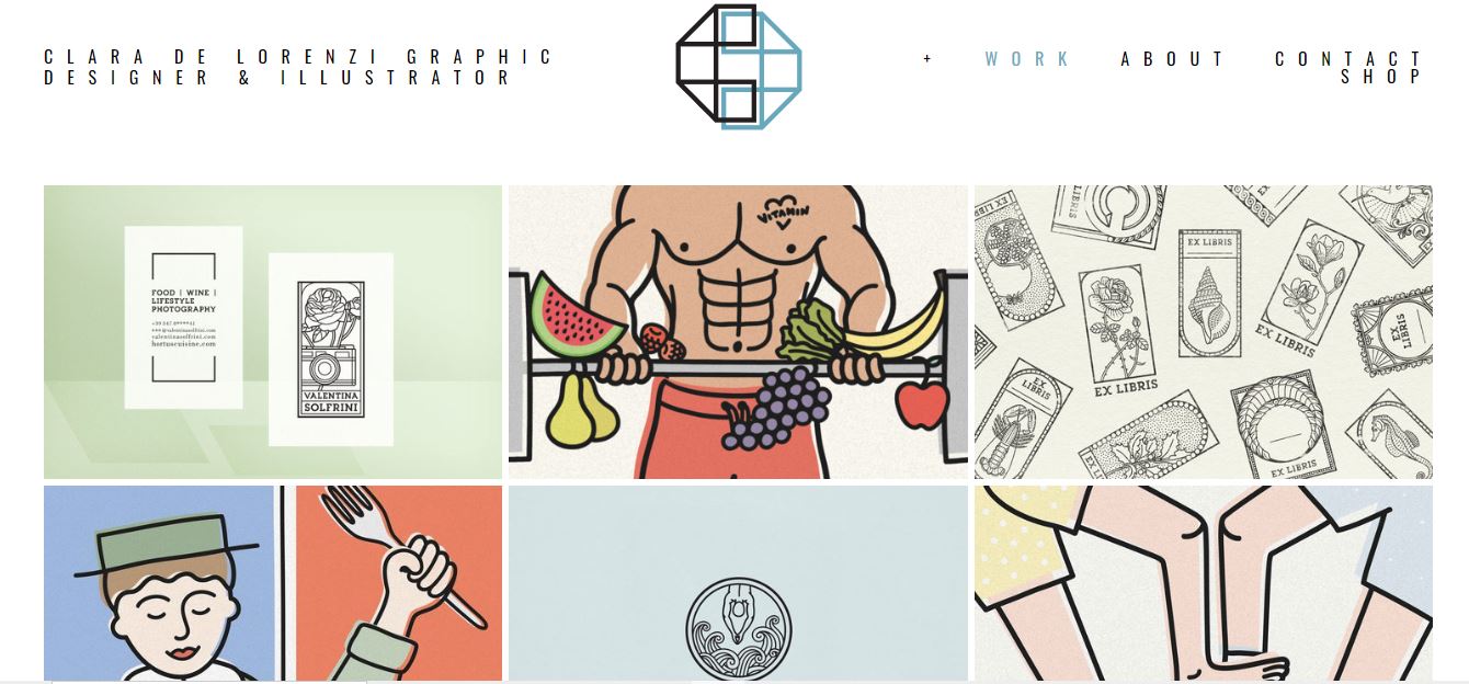
Clara De Lorenzi’s online portfolio website creates a delightful ambiance through its utilization of a full-width grid layout. This layout choice contributes to a visually pleasing and spacious presentation of her work.
One notable feature of the website is the hover functionality implemented for the project titles. As you hover your cursor over a title, it elegantly showcases additional information, offering a sneak peek into each project’s content. This interactive element adds an engaging touch to the browsing experience, enticing visitors to explore further.
Furthermore, Clara’s portfolio employs a seamless transition when clicking on a project. Upon clicking, the project opens on a new page, providing a dedicated space to delve into more details and information. This approach allows for a more comprehensive exploration of Clara’s creative endeavors.
In terms of navigation, the drop-down menu in Clara’s portfolio works exceptionally well. While lacking a search bar, the drop-down menu effortlessly facilitates navigation through various sections or categories. It offers a streamlined and intuitive way for visitors to explore Clara’s portfolio, ensuring easy access to the desired content.
It is worth noting that improving the portfolio navigation could be achieved by incorporating a drop-down menu. This enhancement would further enhance the user experience by providing an organized and efficient means of accessing different sections or projects.
Overall, Clara De Lorenzi’s simple online portfolio website creates an inviting atmosphere with its full-width grid layout. The clever hover functionality and the seamless project page transition contribute to a captivating browsing experience. Incorporating a drop-down menu would be a valuable addition, further enhancing the portfolio’s navigation and ensuring a smoother exploration of Clara’s remarkable work.
2. Ann Gagliano
One standout feature of Ann Gagliano’s Squarespace portfolio is the incorporation of an actual home page, which includes links to both her portfolio page and Instagram profile. This thoughtful inclusion adds a personalized touch and enhances the browsing experience. Additionally, the custom background utilized on the home page adds an exciting visual element, further enriching the overall presentation.
Upon navigating to the illustrations page, visitors are greeted with a dynamic gallery featuring thumbnails at the bottom. This gallery offers multiple convenient ways to navigate through Ann’s illustrations. Users can utilize their keyboard to browse, clicking or swiping through the thumbnails, or they can directly click on a thumbnail to open the full version of the artwork.
It is worth considering an alternative approach to showcasing your works and projects by utilizing a gallery format instead of a grid layout. This allows for a more immersive and interactive experience for visitors. The inclusion of thumbnails at the bottom of the gallery provides a convenient way to navigate through the collection, offering flexibility and ease of use.
3. Luke Adam Hawker
In addition to the header and navigation bar, Luke Adam Hawker cleverly incorporates a top bar notification on his Squarespace portfolio website, which adds an extra layer of functionality and attention-grabbing elements.
The hero section of the website prominently features a large image that immediately captures the viewer’s attention. It is complemented by two prominent call-to-action buttons, strategically placed to encourage user engagement and guide them towards specific actions or content. Following the hero section, Luke includes a well-organized list of upcoming events, markets, and other relevant information, providing visitors with a glimpse into his upcoming projects and activities.
Furthermore, the footer of Luke’s website is thoughtfully designed to offer additional value and convenience. It includes a selection of quick links, allowing visitors to quickly access key areas of interest or important pages. Additionally, a newsletter subscription form is present, enabling interested users to stay updated and connected with Luke’s latest news and developments.
To further optimize your website, consider implementing a top bar notification to draw attention to new products, special deals, or any other important announcements. This can serve as an effective tool for grabbing the viewer’s attention and ensuring that important information does not go unnoticed.
4. Ive Penkova
Ive Penkova’s portfolio page stands out as one of the simplest designs on this list, even without considering the content itself. The emphasis is placed on clean aesthetics and intuitive navigation, allowing the showcased work to take center stage.
The portfolio page begins with a striking full-width banner, which immediately captures attention and sets the visual tone for the rest of the website. The navigation is kept minimal and straightforward, ensuring easy access to different sections without distractions. In the footer, social icons are neatly placed, providing a convenient way to connect with Ive’s social media presence.
A notable feature on the portfolio page is the integration of an Instagram feed. This clever addition offers a means to showcase more content on the website. Video posts open in a new window, allowing viewers to experience the dynamic nature of the content, while image posts open on a new page, providing a focused and immersive view.
The grid layout employed on the portfolio page is both visually pleasing and functional. It allows for the categorization of work examples, enabling visitors to explore a diverse range of projects within each category. The grid layout also facilitates easy navigation, providing a streamlined experience for users to delve into Ive’s extensive body of work.
5. Jessica Chou
Jessica Chou’s Squarespace portfolio example impresses with its extensive length, while the stunning images load seamlessly as the viewer scrolls. This clever technique keeps the viewer engaged, oblivious to the passage of time while exploring the captivating content.
In terms of structure, the website consists of two additional pages, providing concise yet valuable supplementary information, alongside a link to Jessica’s Instagram profile that conveniently opens in a new tab. Notably, a footer section is absent from the website’s design.
To enhance the practicality of the home page, it would be beneficial to incorporate a back-to-top button. This feature would allow viewers to easily navigate back to the top of the page, eliminating the need for endless scrolling in reverse. This small addition would greatly improve the user experience and make browsing more enjoyable.
Furthermore, to create a more engaging experience, consider implementing a content-loading-on-scroll feature. This approach ensures that new content continuously appears as the viewer scrolls down, maintaining their interest and immersion throughout the exploration of the portfolio. By gradually revealing content, the website can provide a dynamic and interactive experience, capturing the viewer’s attention and enhancing their overall engagement.
6. Devon Stank
Devon Stank excels at piquing curiosity with an attention-grabbing full-screen background video placed above-the-fold on their Squarespace portfolio. This strategic placement immediately captivates visitors and sets the tone for an engaging browsing experience.
The hero section of the portfolio is thoughtfully designed, featuring a prominent title accompanied by a compelling call-to-action (CTA) and a play button. Clicking the play button opens a video in a popup, allowing viewers to immerse themselves in the content while retaining the flexibility to close it at any time and seamlessly continue exploring the current page.
One of the standout features of Devon’s Squarespace portfolio is its dark design, which lends an air of premium quality and a sense of luxuriousness to the overall aesthetic. This choice creates a visually striking contrast and elevates the perceived value of the showcased work.
To make a memorable first impression and capture attention, consider incorporating a video above the fold on your website. This impactful placement can effectively engage visitors from the moment they land on your page, encouraging them to further explore your content and stay engaged with your portfolio.
7. La Playa
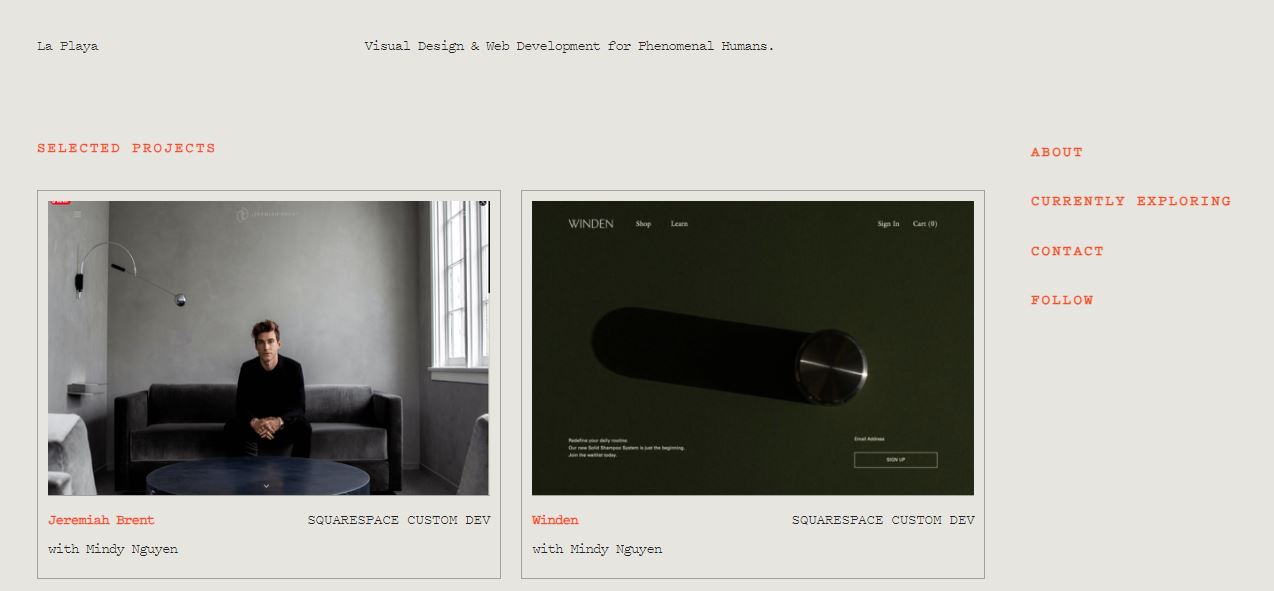
La Playa is an exceptional example of a Squarespace portfolio that exhibits a gray background, complemented by tasteful orange details. This color scheme creates a visually pleasing and harmonious aesthetic throughout the website.
One striking feature of La Playa is its blog-like layout, which adds a dynamic and engaging element to the portfolio. The sticky right sidebar is particularly noteworthy, as it incorporates accordions that provide additional information in a compact and organized manner. This feature allows for the inclusion of more details without cluttering the initial view, maintaining a clean and streamlined appearance.
The base of the portfolio page is structured as a grid of projects, designed to capture attention and encourage exploration. Upon hovering over a grid element, a captivating hover effect is activated, highlighting the selected project while dimming the others. Notably, each grid element serves as a direct link to the corresponding live project, enabling visitors to experience the finished products firsthand.
It is worth noting that the use of accordions in the sidebar adds practicality to the portfolio’s design by allowing the showcasing of additional information without overwhelming the initial look. This feature maintains the visual cleanliness of the layout while providing a means to present supplementary details when desired.
8. Kelsey O’Halloran
Kelsey O’Halloran’s website exudes a distinctive personal touch, starting with a captivating large image of herself accompanied by a title, text, and a compelling call-to-action (CTA) button. This combination establishes an immediate connection with visitors, inviting them to delve deeper into her portfolio.
The website’s sectioned structure, featuring different background colors and creative elements, contributes to a visually appealing and engaging presentation. The deliberate use of white space ensures optimal readability, allowing the content to shine without overwhelming the viewer.
Notably, Kelsey has taken the initiative to provide links to the end products within her portfolio. This thoughtful inclusion allows visitors to explore and interact with her work, providing a tangible experience that goes beyond mere visual appreciation.
To personalize your online portfolio, consider incorporating pictures of yourself and employing effective storytelling techniques. Including images of yourself helps create a sense of connection and authenticity, while storytelling adds depth and context to your work. By crafting compelling narratives around your projects, you can captivate and engage your audience on a deeper level. Additionally, exploring top-notch personal websites can offer inspiration and insights into how others have successfully personalized their online portfolios.
Conclusion:
Don’t miss out on exploring our top 8 Squarespace Portfolio templates! They offer the perfect combination of functionality and aesthetics, allowing you to showcase your work professionally. Whether you’re an artist, photographer, or designer, these templates provide the ideal canvas for your portfolio. With their user-friendly interface and customizable features, you can easily create a unique and engaging website that impresses your visitors. Unlock the full potential of your portfolio today with these exceptional Squarespace templates!
If you are in search of an agency to assist you in creating a stunning Squarespace Portfolio website, look no further. Contact ONext Digital today – Our team of top-notch professionals specializes in Web Design And Development Services. With over 10 years of experience in the field, we guarantee your satisfaction. Let us help you bring your vision to life.
|Read more:
Ultimate Guide To Creating A Stunning Wedding Website With Squarespace


