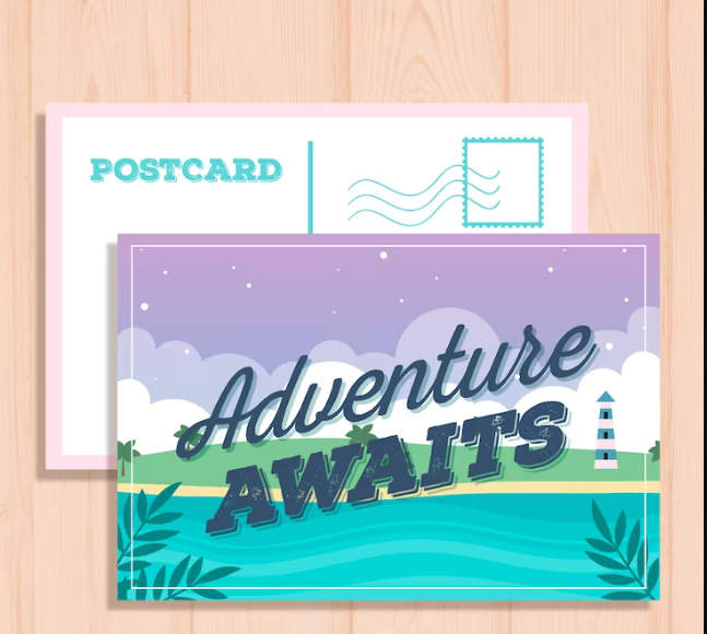
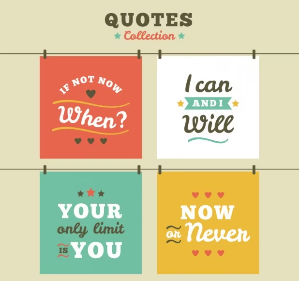
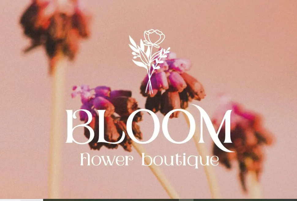
In the age of digital communication and instant messaging, the classic charm of postcards still manages to captivate hearts. Beyond their scenic landscapes and heartfelt messages, postcards hold a certain artistic quality that often goes unnoticed—the typography or font used in their design. Postcard font plays a crucial role in conveying the essence of the message and evoking a sense of nostalgia, reminding us of simpler times when handwritten notes were the norm. This article delves into the world of postcard fonts, exploring their significance, popular choices, and the creative resurgence they’re experiencing.
The Significance of Postcard Font
Fonts are more than just letters; they carry emotions, attitudes, and even eras within their curves and lines. When it comes to postcards, fonts are essential in setting the tone of the message and the overall design. A well-chosen postcard font can instantly transport the recipient to a specific time or place, whether it’s a playful script that exudes whimsy or a vintage serif that recalls the elegance of bygone eras.
Postcard fonts also bridge the gap between the digital and the tangible. In a world dominated by screens, the tactile nature of postcards brings a refreshing change. The font choice serves as a bridge between the printed words and the emotions they convey, making the message feel more personal and heartfelt.
Popular Choices for Postcard Fonts
- Script Fonts: Script fonts are known for their fluid, hand-lettered appearance. They bring a sense of intimacy and informality to postcards, often reflecting the writer’s emotions. Whether it’s a cursive script for romantic notes or a casual brush script for friendly messages, script fonts add a touch of elegance and personal connection.
- Serif Fonts: Serif fonts are timeless and versatile. Their small decorative lines or “serifs” at the ends of characters make them easy to read and lend an air of sophistication to postcards. Vintage-themed postcards often employ serif fonts to evoke a sense of nostalgia, reminiscent of classic typewriter text.
- Sans-serif Fonts: Known for their clean and modern appearance, sans-serif fonts are perfect for conveying a contemporary message or a casual tone. They offer clarity and legibility, making them ideal for postcards that prioritize straightforward communication.
- Handwritten Fonts: In the digital age, the charm of handwriting persists. Handwritten fonts replicate the uniqueness of individual penmanship, adding a personal touch to postcards. They range from elegant and neat to quirky and playful, allowing senders to match the font to the message’s personality.
The Creative Resurgence
While postcards may be reminiscent of times past, they are far from being confined to history. In fact, there is a notable resurgence in the use of postcards as a medium of communication, and this revival extends to the fonts used as well. Designers and artists are combining the nostalgia of postcards with modern typographic trends, resulting in innovative designs that capture attention.
Moreover, the emergence of online platforms and tools for designing personalized postcards has given individuals the opportunity to experiment with postcard fonts. People can now choose from a wide range of fonts, customize their messages, and add personal touches before having the physical postcards sent out. This blending of old and new showcases the adaptability of postcard fonts in embracing contemporary modes of communication.
Steps to design a postcard font
Designing a postcard font involves creating a typeface that embodies the essence of postcards – something that is visually appealing, easy to read, and evokes the feeling of sending and receiving messages through postcards. Here’s a step-by-step guide on how to design a postcard font
Conceptualization and Inspiration
Start by brainstorming ideas and gathering inspiration for your font. Consider the style of handwriting, calligraphy, or typography that you believe captures the essence of postcards. Look at vintage postcards, handwriting samples, and decorative elements that are commonly associated with sending messages.
Choose the Design Software
You’ll need design software to create your font. Popular options include Adobe Illustrator, Glyphs, FontLab, or even software like Inkscape if you’re looking for free alternatives.
Sketching
Begin with pencil and paper. Sketch out the characters of your font, focusing on creating a consistent style that aligns with your postcard theme. Keep in mind the variations between uppercase and lowercase letters, as well as special characters, numerals, and punctuation marks.
Digitize Your Sketches
Scan or photograph your sketches and bring them into your chosen design software. Use the software’s tools to trace over your sketches digitally, refining the shapes and curves to create smooth vector paths.
Create Consistency
Ensure consistency in stroke width, spacing, and proportions across all characters. This consistency is crucial for a balanced and readable font.
Refine Characters
Spend time refining each character individually. Pay close attention to details such as terminals, serifs (if any), and any decorative elements you want to include.
Special Characters and Alternates
Design alternative versions of certain characters to add variety to your font. Many fonts include ligatures, swashes, and stylistic alternates to provide designers with creative flexibility.
Kerning and Spacing
Adjust the spacing between characters (kerning) and overall letter spacing to ensure optimal readability. Kerning is especially important for maintaining visual harmony between adjacent characters.
Test and Revise
Create sample texts or words to test your font’s readability and aesthetics. Identify any inconsistencies, awkward spacing, or unclear characters and make necessary revisions.
Exporting the Font
Once you’re satisfied with your font, export it in the appropriate file format. Common formats include OpenType (.otf) or TrueType (.ttf). Make sure to embed the necessary font metadata.
Documentation
Create a documentation file that outlines the characters, keyboard shortcuts for accessing alternates, and any other relevant information about your font.
Distribution
If you intend to share or sell your font, you can distribute it through font marketplaces or your own platform. Be sure to follow any licensing guidelines and copyright considerations.
5 Best Postcard Fonts for Picturesque Designs
1. Postcard Script
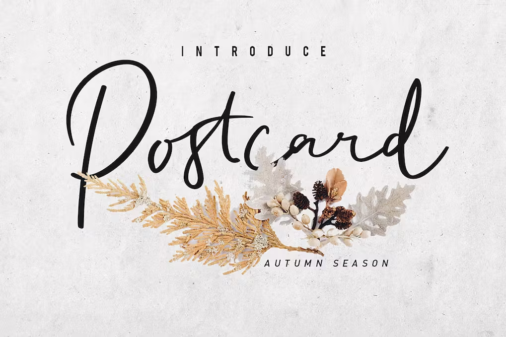
Postcard Script is a font style characterized by elegant handwriting. It enhances the communication of your design by facilitating the message’s conveyance. This font is suitable for a variety of purposes, including eye-catching displays, weddings, birthdays, labels, clothing, movie scenes, posters, movie titles, gigs, album covers, logos, and numerous other applications.
Features include:
- Postcard Script
- .otf and .ttf formats
- Uppercase and lowercase letters
- Numerals and punctuations
- Lowercase alternates for added variety
- Ligatures to enhance the visual appeal
Best regards, GIEMONS
2. Royal Crest
Contemporary, sophisticated, and adorned – introducing the Royal Crest serif typeface. Its meticulously crafted characters exude intricate elegance, rendering it an ideal choice for upscale ventures seeking tasteful embellishments, all while maintaining a refined balance. Complementing its allure is an expansive array of alternative characters, empowering you with the versatility and imaginative freedom to craft remarkable, one-of-a-kind designs.
From logos and wedding invitations to web designs and print advertisements, Royal Crest ensures a memorable impact. Ready to assert your presence? Express it eloquently with Royal Crest: the indispensable font for contemporary digital designers.
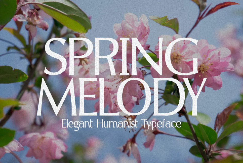
3. Spring Melody
Spring Melody, a graceful humanist typeface that exudes elegance. With its refined curves, meticulous kerning, and crisp edges, Spring Melody embodies a harmonious aesthetic. This font is a seamless fit for crafting sophisticated, uncluttered, and nostalgic designs, ranging from branding and packaging to social media, wedding invitations, advertisements, editorial layouts, and beyond.
If your aim is to infuse a touch of opulence into your designs, your search ends with Spring Melody. This typeface is the embodiment of the luxury you seek.
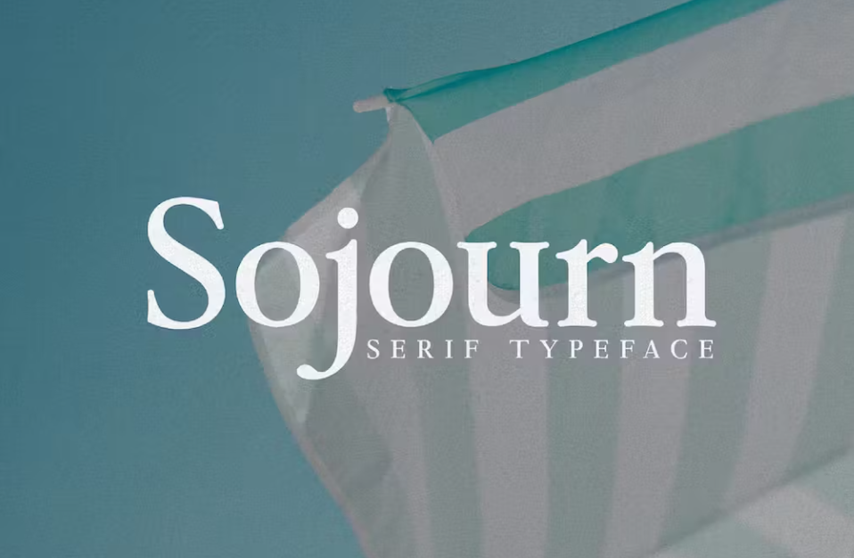
4. Sojourn – 1980s Serif Typeface
Meet Sojourn – an homage to the vibrant spirit of the 1980s, captured within a serif typeface.
The resurgence of layered, type-centric designs inspired by 1980s advertising is becoming a prevailing trend. Sojourn steps onto the scene to invigorate your creative endeavors and bring forth captivating visual concepts. Much like Apple’s iconic 1980s advertisements, which pioneered this aesthetic through the groundbreaking 1984 Macintosh launch campaign.
Design Tip: The secret to mastering this aesthetic involves adjusting the tracking to a negative value (whether in Adobe Photoshop or Illustrator), tailored to the mood you intend to convey. This technique tightens the letter spacing, although utmost clarity of the text remains essential.
This font is available in two iterations: regular and italic. For a glimpse into the font’s personality, take a look at the preview images provided.
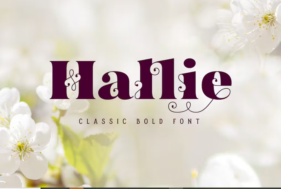
5. Hallie – Bold Classic Font
Allow us to present Hallie, a timeless and robust font selection. This sophisticated serif typeface boasts an exquisite interplay of striking contrasts within its shapes. The delicate, intricate details harmonize seamlessly with the bold foundational forms, creating a fusion of vintage allure and contemporary flair. Hallie doesn’t stop there – its repertoire includes an array of ligatures and swash symbols, facilitating the crafting of distinctive lettering arrangements. With its versatility, Hallie finds its ideal application in label and postcard designs.
Wishing you a pleasant day ahead!
Conclusion
Postcard fonts possess a unique power—the ability to infuse a tangible piece of paper with the emotions, memories, and thoughts of the sender. Their choice is not just about aesthetics, but also about connecting the past and present, the digital and tangible, and the personal and shared experiences. Whether it’s a script that dances across the page or a serif font that whispers of days gone by, postcard fonts continue to weave an enchanting narrative that transcends time and technology. So, the next time you send a postcard, take a moment to consider the font—it’s a small detail that holds a world of meaning.
Learn more about ONEXT DIGITAL
ONext Digital is a software company, specializing in Web, app design & development.
Are you looking for an agency to help you create a highly-responsive mobile app and website? we can help you drive your business forward with our dedicated developers. We provide flexible hiring options for web & mobile development projects to ensure timely delivery and high-quality output. Let us guide your progress forward.


